


Divider Pages for
“Earthquakes, Mudslides, Fires & Riots:
California & Graphic Design, 1936–1986”
DESIGNED 2013
This book is CalArts faculty Louise Sandhaus’ idiosyncratic perspective on the beginnings of Californian graphic design. The selection is as succinct, surprising and powerful as the presentation. It expands on the established canon by including unseen works by masters and masterful works by unknowns.
I've always thought of West Coast graphic design as more interesting and edgy as East Coast or European equivalents. This book proves that it's also equally important; thereby changing the design canon as written by the East Coast establishment. You’ll learn that for every Rand there’s a Bass and for every Sutnar there’s a Lustig. You'll also learn that there are more incredible female designers than previously reported. Every page is a testament to West Coast dominance in motion graphics, in female designers, in graphic Modernism and in design for alternative cultures.
I had known about this book for as long as Louise had been working on it, but I had no idea just how awesome it was going to be. I’ve only provided a few fonts and designed four divider pages without seeing the whole book.
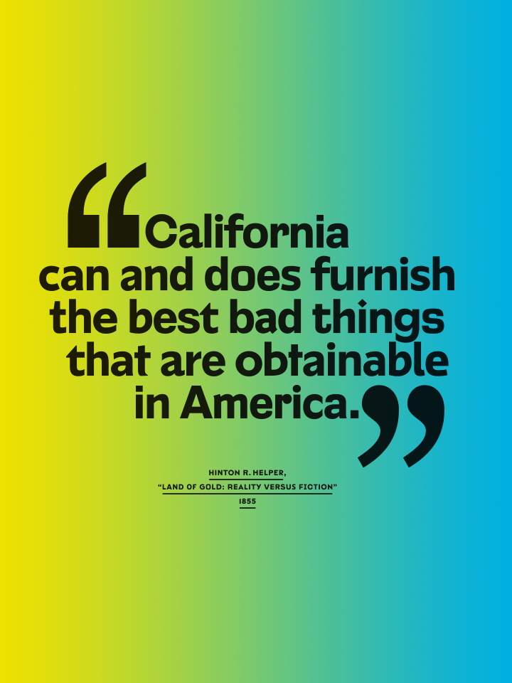
For the visualization of the four quotations, I did a little exercise based on the concept of my graduate thesis, the Compendium of Alphabets. Simply put, Compendium is a font made out of other fonts. All glyphs are referencing letters from existing typefaces; I traced their skeletons and redrew them with consistent physical dimensions.
The result is fascinating riddle aimed at type connoisseurs for whom a lot of the letters should look familiar, particularly earmark letters such as the peculiarly truncated “f” of Dwiggins’ Metro, or Monotype Gill Sans’ strangely flat-bottomed “d”; or Edward Johnston’s diamond-dotted “i”.
In theory, no two designs of one glyph need to be the same, raising questions about consistency within an alphabet, a typeface or a typeface family. The entire editorial design of the book exclusively uses letters from the Compendium typeface world.


Other details of the book showcasing the typeface tribe CIA Compendium.
-----------------------------------
Client: Louise Sandhaus/Metropolis Books
Book Design: LSD (Louise Sandhaus Design) with Thomas Kracauer, Kaoru Matsushita, Christopher Morabito, Derrick Schultz, Hayden Smith
Diagram Design: Katherine Catmur with Benjamin Woodlock
Quotation Pages Design: Jens Gehlhaar
Client: Louise Sandhaus/Metropolis Books
Book Design: LSD (Louise Sandhaus Design) with Thomas Kracauer, Kaoru Matsushita, Christopher Morabito, Derrick Schultz, Hayden Smith
Diagram Design: Katherine Catmur with Benjamin Woodlock
Quotation Pages Design: Jens Gehlhaar