El Condor Logo & Identity
DESIGNED 2014
I designed this identity for and with Tyler Bell, a Los Angeles-based restaurateur.
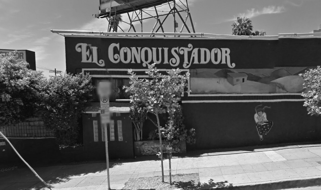
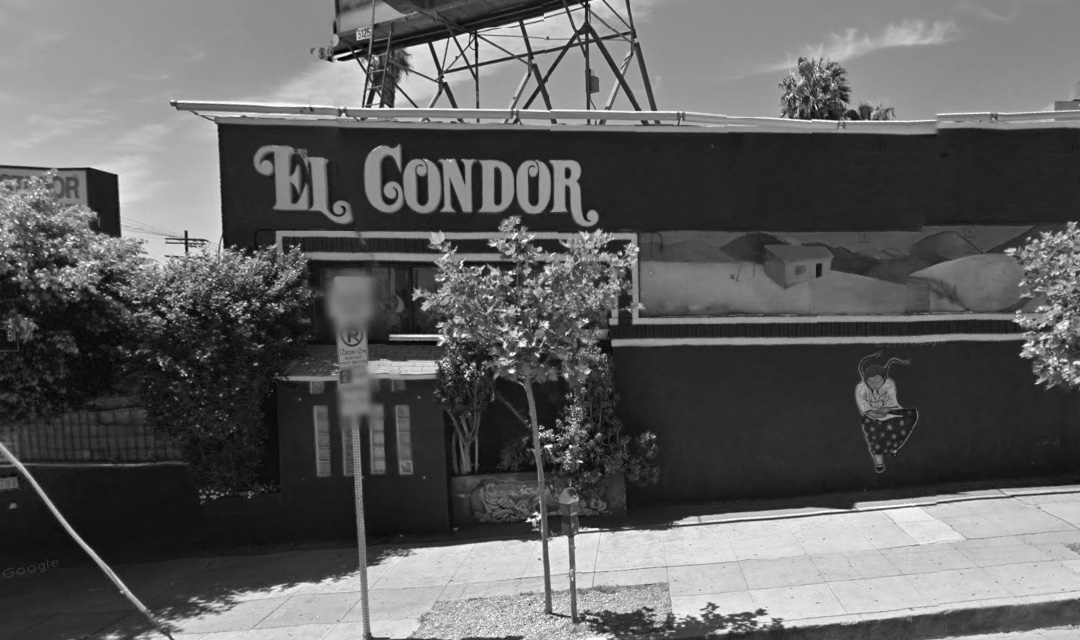
“El Condor” is a Mexican Restaurant on Sunset Boulevard in Silver Lake, Los Angeles. Tyler and his partners took over the license from a 30-year old restaurant called “El Conquistador”. I thought the naming was brilliant: By using the same letters, it expressed respect for its previous incarnation and patrons. And by making the name shorter, it promised a simpler, more modern, maybe even leaner experience.
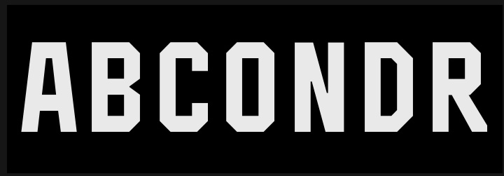
So for a minute, I thought it would be a great strategy to keep the existing awesome Seventies lettering and to simply re-arrange the letters:
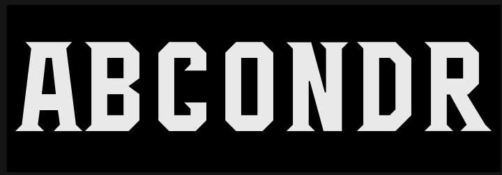
In the end, this seemed a bit too clever for its own sake, so I designed a bunch of logos that at various times may all resurface for special events or on give-away objects. The logo that turned out to be the hero (see above) is inspired by a 1971 Hawkwind album cover designed by Barney Bubbles (itself probably influenced by Mayan iconography); and is made of a type tribe I made for the ESPN X Games in 2001. The typeface is a jocky Grecian that's started to hang with the skaters and developed a passion to dress up with Latin serifs and Victorian notches. The logo is made of a bunch of variants from this tribe:


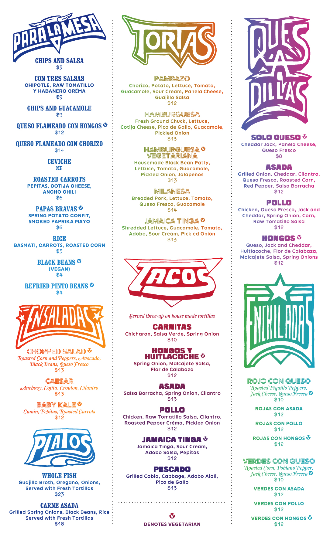
For the menus, Tyler Bell drew a series of campy, witty, funky headers inspired by Mexican music walls that themselves reference Seventies Rock logos (“bardas de baile”). We mixed it with the rainbow gradients of Mexican blankets and Colby posters; and used an eclectic array of typefaces in the traditions of Victorian broadsheets and Californian Deconstructivism. The typefaces include the as-yet unreleased Neuwelt Inline designed by me; as well as a rare proto-Grunge B-side by Neville Brody, Fuse Populist.
-----------------------------
Client & Design: Tyler BellDesign: Jens Gehlhaar