Zune “Stacks”
PRODUCED AT BRAND NEW SCHOOL, 2008
All too often motion graphics work is compromised by over-reaching ambition; just because you sort of know how to set type, how to point a camera at a green screen or how to draw some doodles doesn't mean you should. Too many pieces are found trying, especially when compared to the high marks of those fields that motion graphics is routinely intruding into, such as Luke Hayman’s typography, Laika’s character animation, Digital Domain’s CG, Dante Ariola’s storytelling or Christoph Niemann’s illustration.
But every once in a while, there is a job that actually requires an individual, a team or a company “sort of” versed in all of the visual communication crafts.
“Stacks” came to Brand New School as a CG animation project that included a heavy amount of print graphic design. One sentence worth of copy would be spelled out on album covers in a (digitally created) juke box. During the bidding process, that idea changed, the budget grew, and we had a curious hybrid on our hands.
When design and video are combined in hybrid forms of film making, it’s usually live action characters in front of CG backgrounds, or CG characters inserted into live action plates. What happens less often is that the graphic design capabilites of a motion graphics firm are applied to orthodox graphic design, which then gets produced as a physical object and used as a prop or part of the set design in a filmed set. I had done it before for “Fliers”, a Coca-Cola spot in which fictitious band posters play a main role (and I had given a lecture about how the AIGA didn’t think they constituted graphic design).
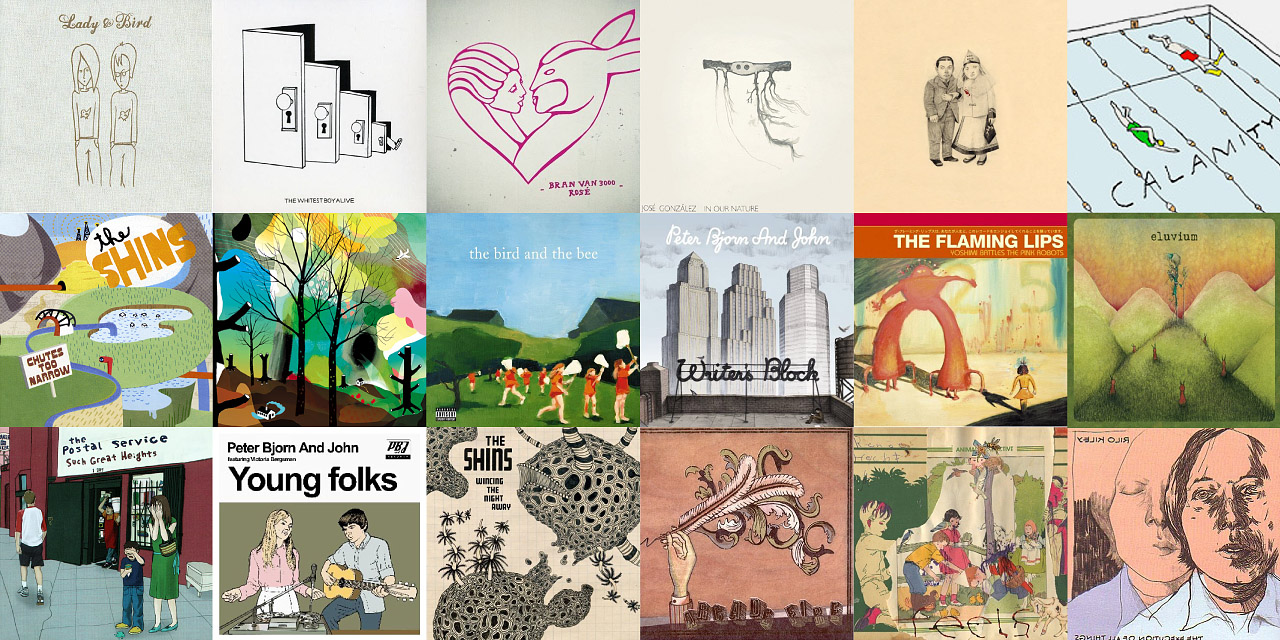
For “Stacks,” we had to design a dozen album covers that had to read like real, contemporary, legit products, and also convincingly represent a dozen genres. At the same time, the covers also had to be literally legible; so each had to carry one to three large words that, ideally, would look like the album title or artists’ name.
We created a list of musical genres and collected representative album cover art for each. It was embarrassingly simple to identify visual signifiers for each genre: a specific image making technique, a narrow range of colors, a way of cropping a portrait, and — voila! — you had a pop, metal, rap or a sensible-indie-music-with acoustic-guitars album:


Simultaneously, my co-director Ludovic Schorno and I kept shooting camera tests to figure out just how large the type needed to be, whether it could be anywhere on the cover or had to be at the top, whether we should sort through crates or stacks, and how fast we needed to move the camera or file through the records in order to read the copy:
Video Test (2008/0:30)
After a round of designs using Google grabs, we produced a still shoot to generate the cover photographs. Given the domination of portrait covers in many of our musical genres, any selection of a dozen albums obviously had to feature some faces. However, the budget didn’t allow for a dozen principals, so we got creative with the lighting, the wardrobe and the placement of the type.
After a round of designs using Google grabs, we produced a still shoot to generate the cover photographs. Given the domination of portrait covers in many of our musical genres, any selection of a dozen albums obviously had to feature some faces. However, the budget didn’t allow for a dozen principals, so we got creative with the lighting, the wardrobe and the placement of the type.
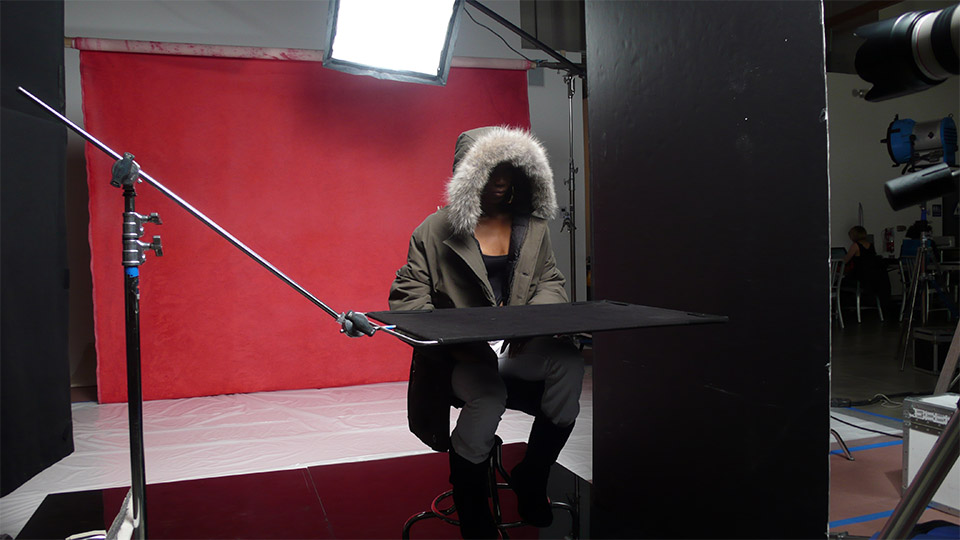
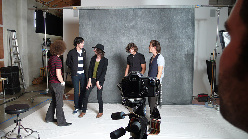

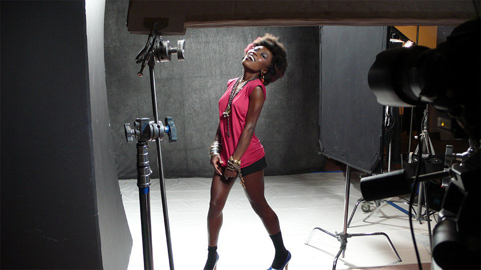
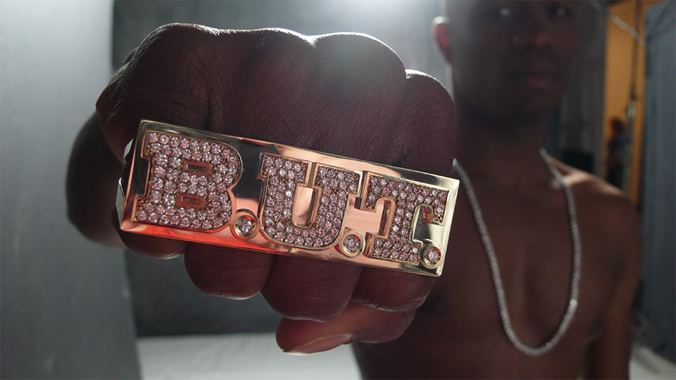
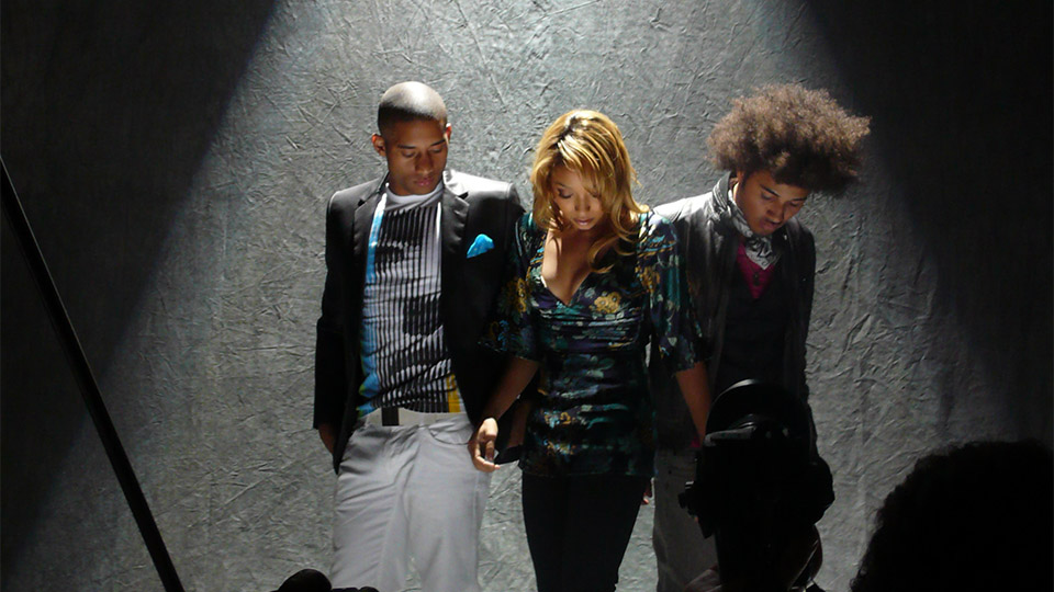


Some pictures from a fun day of creating fake bands and singers.
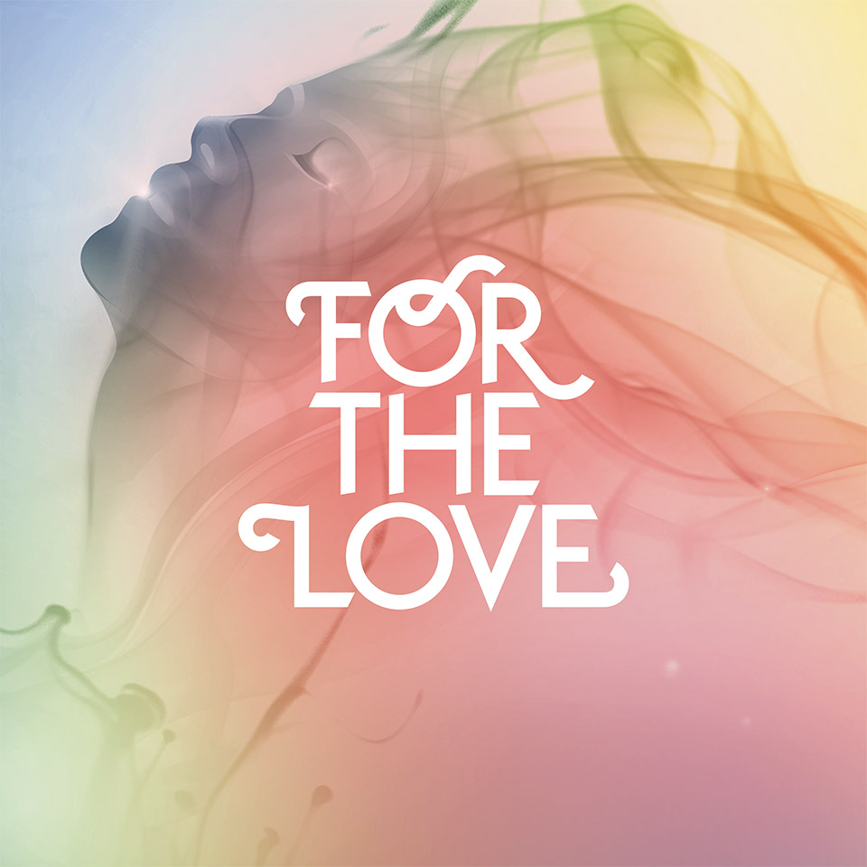
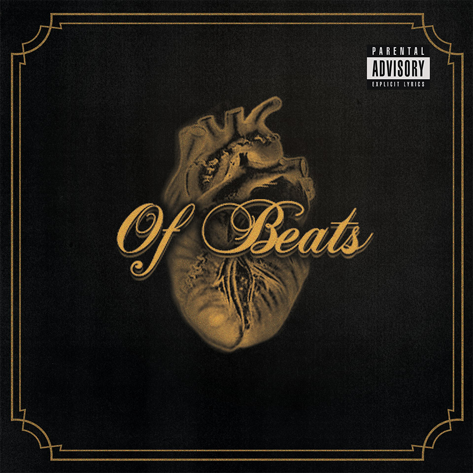


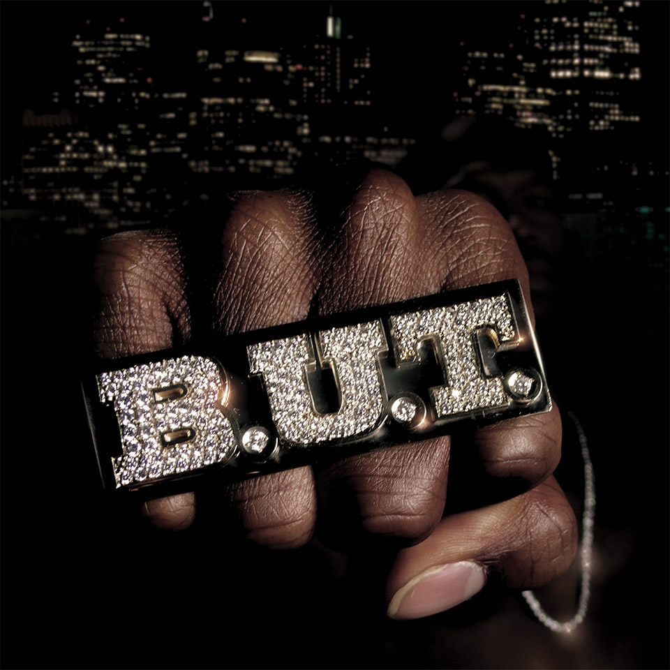

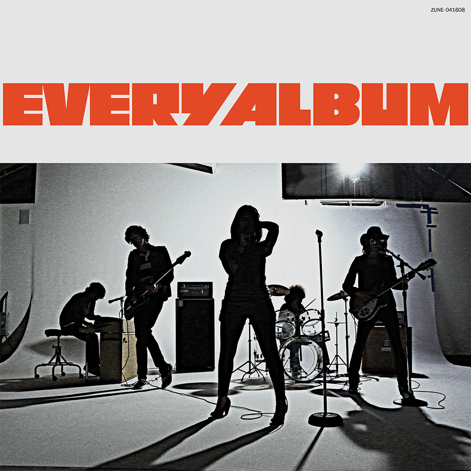


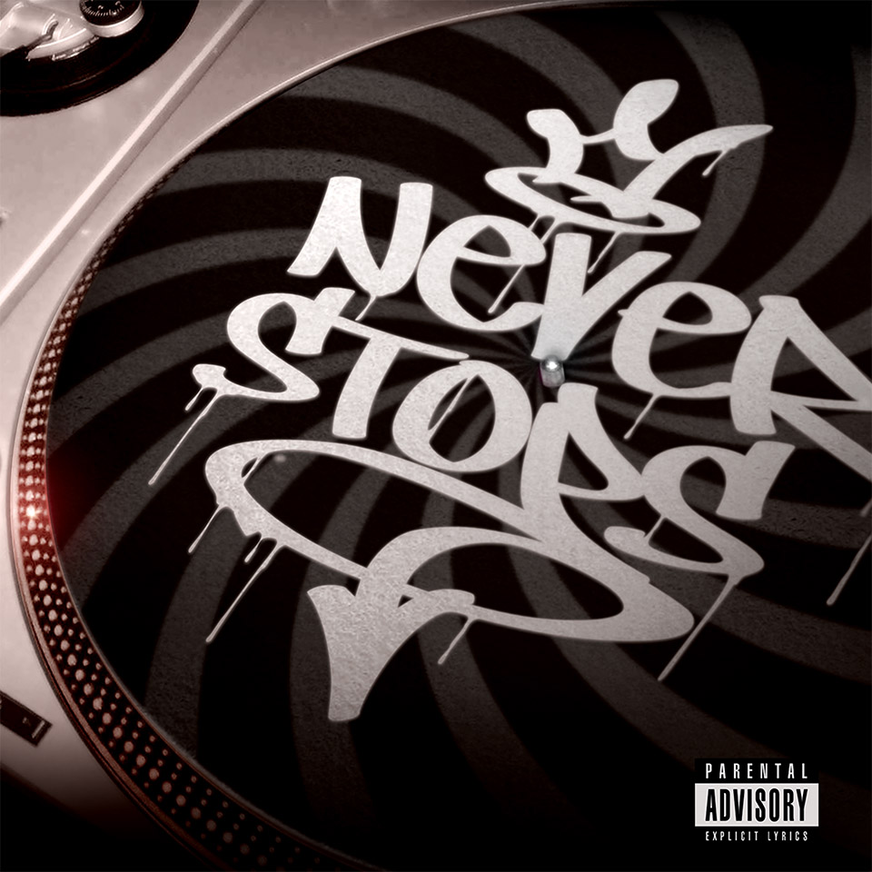
These are the albums we designed. Photography by Ian Brook, styling by Jeanne Chang.
Agency: T.A.G., San Francisco
Client: Microsoft
Production Company: Brand New School, Los Angeles
Director: Jens Gehlhaar
Director: Ludovic Schorno
Producer: Annie Johnson
Director of Photography: Tami Reiker
Production Designer: Brian Branstetter
Stylist: Jeanne Yang
Shot on location in Los Angeles
Design, Pre & Post Production: Brand New School, Los Angeles
Creative Director & Designer: Jens Gehlhaar
Art Director: Ludovic Schorno
Designers (cover art): Andy Bernet, Eli Carrico, Anthony Furlong, Wakako Ichinose, Jeremy Landman
Still Photographer (cover art): Ian Brook
Production Designer: Brian Branstetter
Stylist: Jeanne Yang
Editor: Mark Imgrund
Flame Artist: Ryan Yoshimoto
Post Producer: Darren Jaffe
Color: Company 3, Santa Monica
Music: N.E.R.D., “Spaz”
------------------------------
Agency: T.A.G., San Francisco
Client: Microsoft
Production Company: Brand New School, Los Angeles
Director: Jens Gehlhaar
Director: Ludovic Schorno
Producer: Annie Johnson
Director of Photography: Tami Reiker
Production Designer: Brian Branstetter
Stylist: Jeanne Yang
Shot on location in Los Angeles
Design, Pre & Post Production: Brand New School, Los Angeles
Creative Director & Designer: Jens Gehlhaar
Art Director: Ludovic Schorno
Designers (cover art): Andy Bernet, Eli Carrico, Anthony Furlong, Wakako Ichinose, Jeremy Landman
Still Photographer (cover art): Ian Brook
Production Designer: Brian Branstetter
Stylist: Jeanne Yang
Editor: Mark Imgrund
Flame Artist: Ryan Yoshimoto
Post Producer: Darren Jaffe
Color: Company 3, Santa Monica
Music: N.E.R.D., “Spaz”