


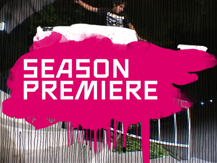
Fuel TV 2003 Network Identity
PRODUCED AT BRAND NEW SCHOOL, 2003
Traditionally, a broadcast graphics package consists of a limited set of toolbox elements such as transitions, topgraphics, end pages etc. Designers typically provide a strict set of rules and elements to define and unify the look, partly out of logistic necessity, partly out of the desire to penetrate the brand and thus make the channel easily identifiable.
The commercial subcultures of action sports, however, grew out of the Generation X in the early Nineties. Companies like Burton, Girl or Vans have responded to the audience's knowing and cynical attitude towards marketing by developing subversive branding strategies or by ignoring the idea altogether. One of these strategies is a constant reinvention and redefinition of the brand, akin to the way the fashion industry works. Another strategy seems to be a lack of tight control over a brand's output and shape: Products, advertising and writing sometimes seem to be riffed and improvised rather than planned and labored, with a healthy attitude towards occasional failure.
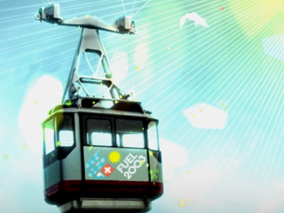
The launch design for Fuel TV was designed with a similar spirit. Instead of designing one promo package that is re-used and repeated for every promo, we devised six different ways of doing them to avoid penetration. Instead of using a recognizable color palette, we made most elements keyable over footage, so that the channel looks like its ever-developing content and not like its committee-created identity.
Fuel TV 2003 Identity (Montage, 0:27)
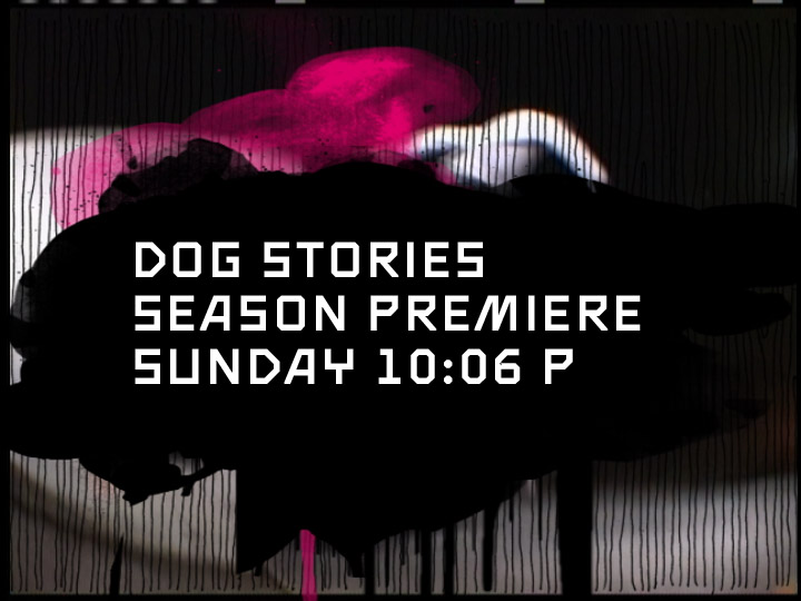
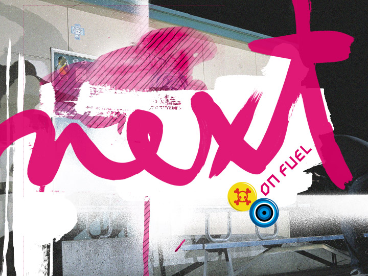
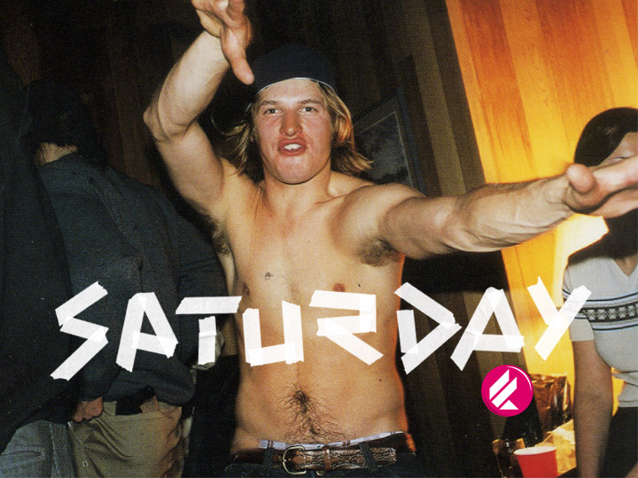
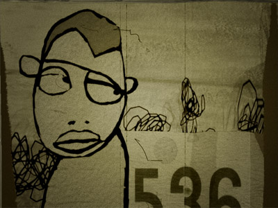
The resulting tone can be described as unpretentious, self-made, low-tech, generic and textural. It is a relatively unstructured, free-form improvisation with a set of very simple layers of handmade stuff rather than an organized grid of tightly defined design elements. The frame compositions, the typography and the animations are very raw and basic.
Another observation we made in our research is how diverse the subcultures of action sports are. While all of them are unified by shared keywords such as rebellion, risk or freedom, some of them are quite different from one another. The quiet and environmentalist tone of some surf cultures, the urban and artistic attitude of some skateboarding communities and the aggressive and destructive tendencies of some motocross fans have very little in common with each other. By using a high degree of abstraction, the graphic language unifies traces of all these subcultures.
These are the categories of elements:
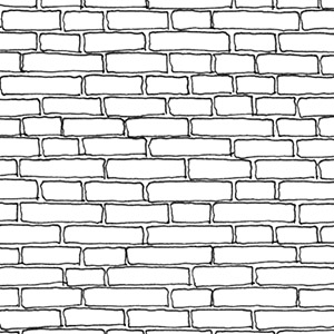
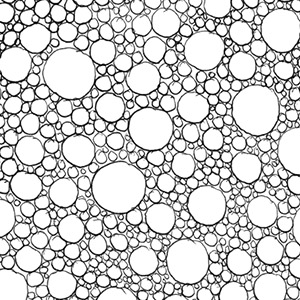
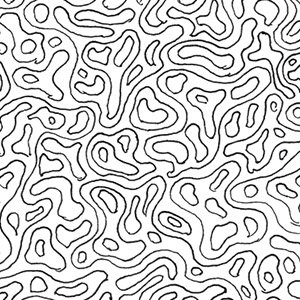
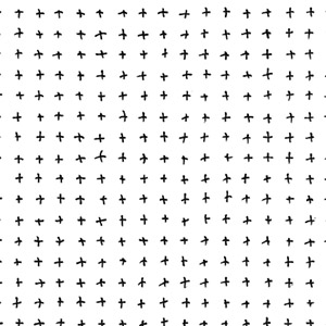
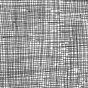
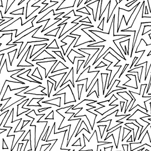
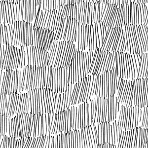
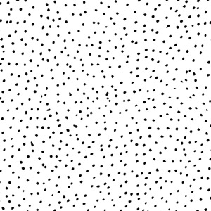
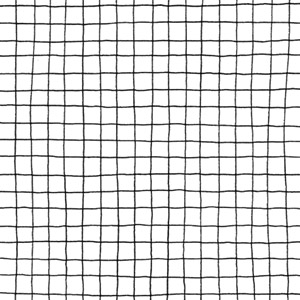
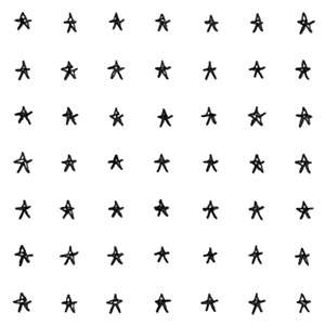
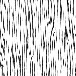
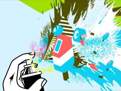
These patterns serve as stark and abstract signifiers for various strains of youth culture. In order to unify these contradictory references, they were drawn with a simple ballpoint pen. There is a square grid signifying New Wave culture or evoking high school memories of notepads; the wood grain reminds of surf- or skateboards; there is a camouflage pattern that has been a staple of street style since the Vietnam war and has now been claimed by skate and hip hop culture; a star field is reminiscent of the proud display of Americana in various motor sports etc. The patterns appear in black or white and are used as textures and transitional elements.

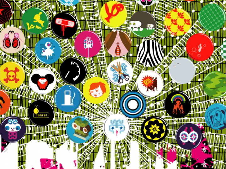
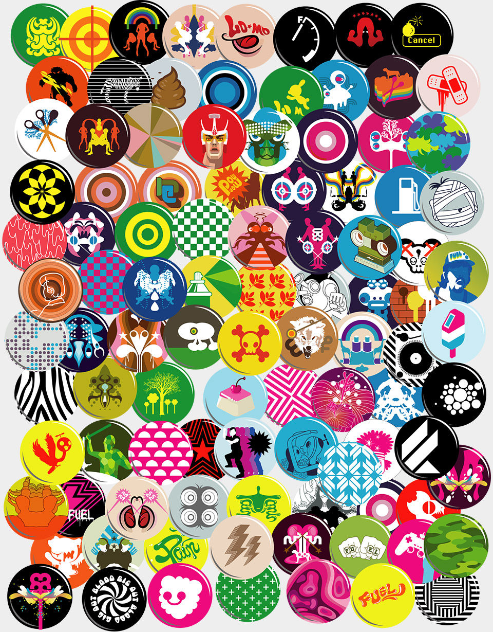
Outside of political campaigns, buttons are signifiers for rebellion, subversion and protest, be it anti-war activism or punk nihilism. Saiman Chow designed around sixty buttons that are used on-air and are manufactured as give-aways. The themes are very diverse and nonsensically eclectic, their usage is random.
We provided a set of abstract paint and ink textures: Brush strokes, dripping paint, ink splashes. As traces of an individual’s hand, these are signifiers for self-expression and freedom. The exposure of the materials and processes of painting has been the primary interest of 20th century expressionism as well as of contemporary artists with graffiti backgrounds.
Black, white and magenta. Almost none of the graphics are full-frame, which means that the color climate of the network will be determined by the footage used rather than the graphics. While magenta is a default color, in combination with stark black and white it carries a strong connotation of 1970s punk culture.
Masterful and skilled typography with a sensibility for the delicacy of letter forms has never been a strength or even a part of subcultures and would come across as pretentious and inauthentic. We picked a set of five sturdy and stereotypical typefaces, and never use them in combinations but in uppercase only, with default tracking and leading. Two of them — the angular square and the obligatory stencil — were designed by me.

Orthodox marketing strategy dictates that a campaign of ten spots is better than a single spot repeated ten times or than ten unconnected spots. The argument is obvious: A campaign reinforces the marketing message (more than ten unrelated spots could do), but without getting annoying (like the same spot repeated ten times would do).
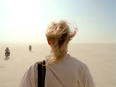
Fuel TV’s audience, however, would be turned off by the mere smell of a marketing strategy. For the launch of the station, we wrote and produced ten different station identifiers with ten completely different looks, vibes, narratives and messages.
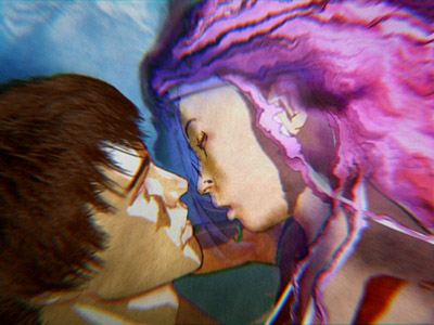
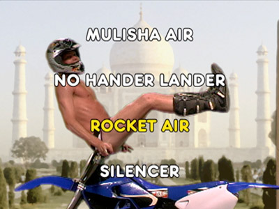
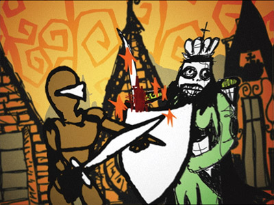
Techniques range from film and video to 3D animation, from cel and stop-motion animation to slide shows of stills and Quicktime VRs. Some of them are funny and cute, others are just plain beautiful, some are contemplative, others are parodic and referential. Indeed, the main point of this first round was to introduce a spectrum as wide as possible. Since there is no overriding campaign strategy to the series of identifiers, they can be constantly reinvented, changed, evolved or expanded. The concept cannot go out of style.
Since we started the series, Fuel TV has commissioned pieces directly from artists or produced them in collaboration with other design studios without changing the strategy. The only consistent element in all these IDs is the end card, which features a massive Fuel logo as well a line of type that can be used to title or to tag the piece.
For the launch package, I directed two of the pieces (“Superskate” & “Motosutra”) and creative-directed the rest.
We also came up with a special version of station identifiers that we call Signature IDs. Inspired by the idea of signature skateboard decks created by or for athletes, these IDs can serve many purposes: To associate the channel with a well-known athlete, to introduce an exciting and appropriate artist to the audience, or to serve as a new and exciting outlet for athletes who express themselves in art or music. I collaborated with Saiman Chow, Andy Jenkins, Doug Aitken and Chris Pastras on the first batch.
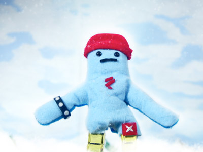

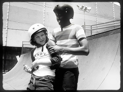
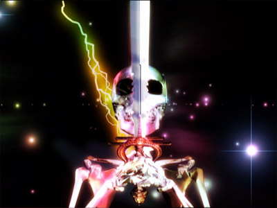

An overview of all station IDs created within the first year of the channel. From top left: The Pinto series, “Superskate,” “Lil Andy,” “Fuel Fantasy,” “Lost At Sea,” “Motosutra,” the Respect series, ‘Sites,” and Signature IDs by Saiman Chow, Andy Jenkins, Doug Aitken and Chris Pastras.
Print Ads
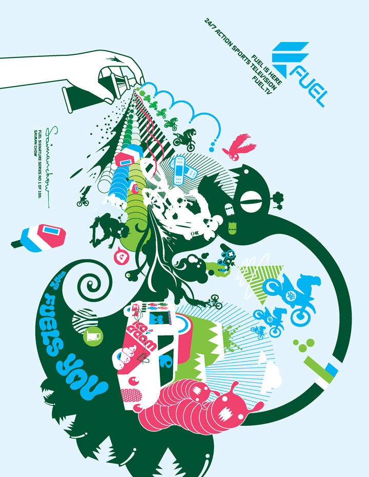
We also designed a series of print ads, using imagery culled from the station identifiers. The pages were designed to stand out with their ambiguous orientation, which is both an expression of the disorienting acrobatics of air tricks as well as an enthusiastic embrace of the joys of print by a designer stuck in TV.
We also designed a series of print ads, using imagery culled from the station identifiers. The pages were designed to stand out with their ambiguous orientation, which is both an expression of the disorienting acrobatics of air tricks as well as an enthusiastic embrace of the joys of print by a designer stuck in TV.


In 2009, we were invited back to redesign the channel for a new decade.
------------------------------
Client: Fuel TV, Los Angeles
Creative Director: Jake Munsey
Production: Brand New School, Los Angeles
Creative Director & Designer: Jens Gehlhaar
Creative Director & Designer: Jonathan Notaro
Button Designer: Saiman Chow
Animators: Rob Feng, Trix Taylor, Mark Kim, Kyu Kim
Producer: Rosali Concepcion
Music: Machine Head, Venice Beach
Awards:
83rd ADC Annual Awards: Distinctive Merit
365: AIGA Annual Design Competition 25
AIGA “Grown in California” 2004
California Design Biennial, 2004
BDA Design Awards, 2004 (4 Gold, 3 Silver)
More Fuel TV:
Fuel TV 2010 Redesign
Fuel TV "Board Breakers Anonymous"
Fuel TV "The Fuel Experiment"
Fuel TV "Superskate"
Fuel TV “Motosutra”
More network identities:
IMF The International Music Feed Identity
VH1 Classic Identity
ESPN X Games IdentityMTV Sunday Stew “Parade”
MTV Sunday Stew “Machine”
MTV 2 Redesign