
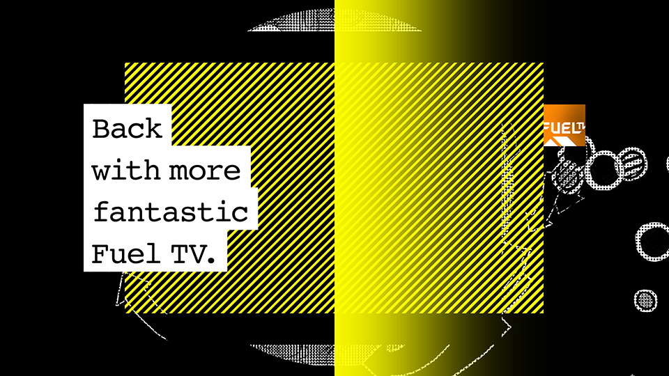


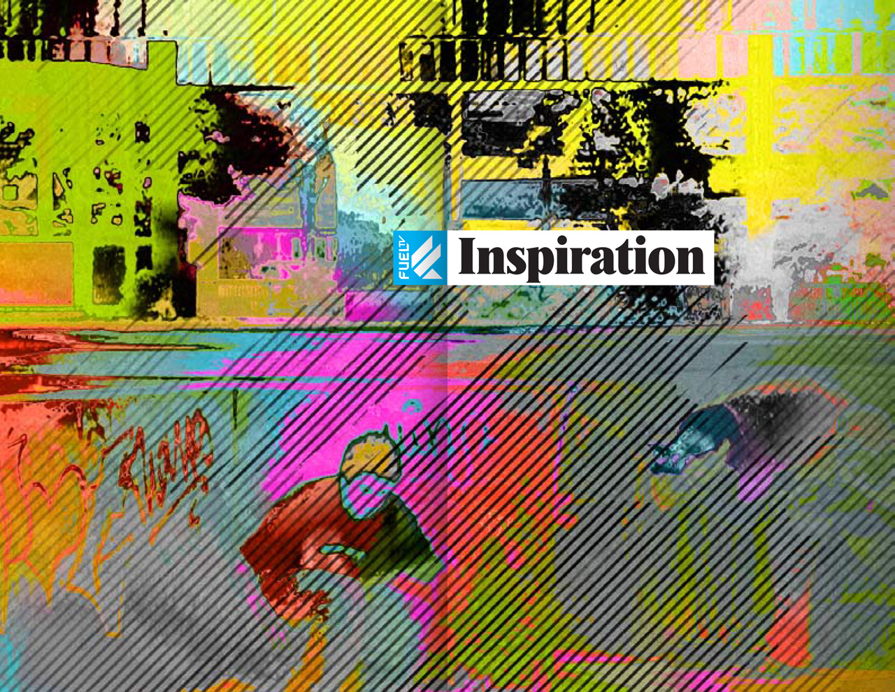
Fuel TV 2010 Network Identity
DESIGNED AND PRODUCED
AT BRAND NEW SCHOOL, 2009—10
In 2003, motion graphics company Brand New School won a pitch to design and produce the on-air identity for a brand-new U.S. channel dedicated to extreme sports: Fuel TV, owned by Fox but run with relative independence.
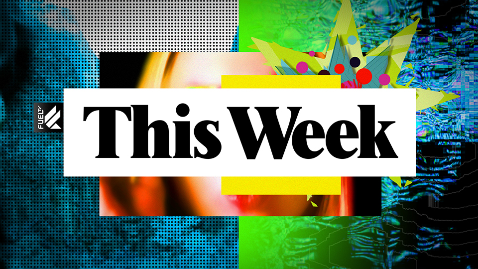
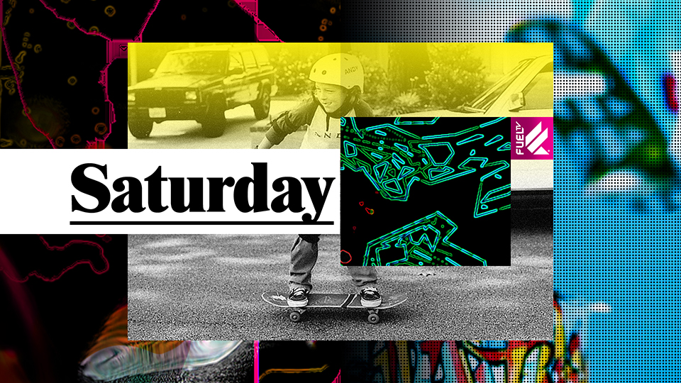
Six years after completing the launch design, Brand New School was invited back to rethink the channel for a new decade. Apart from an extensive on air package, the redesign also included all of Fuel TV’s webcast and podcast graphics.
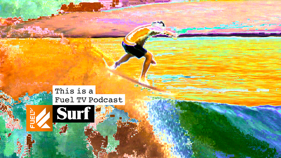
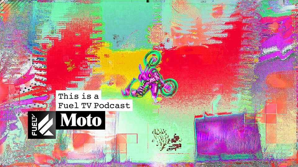
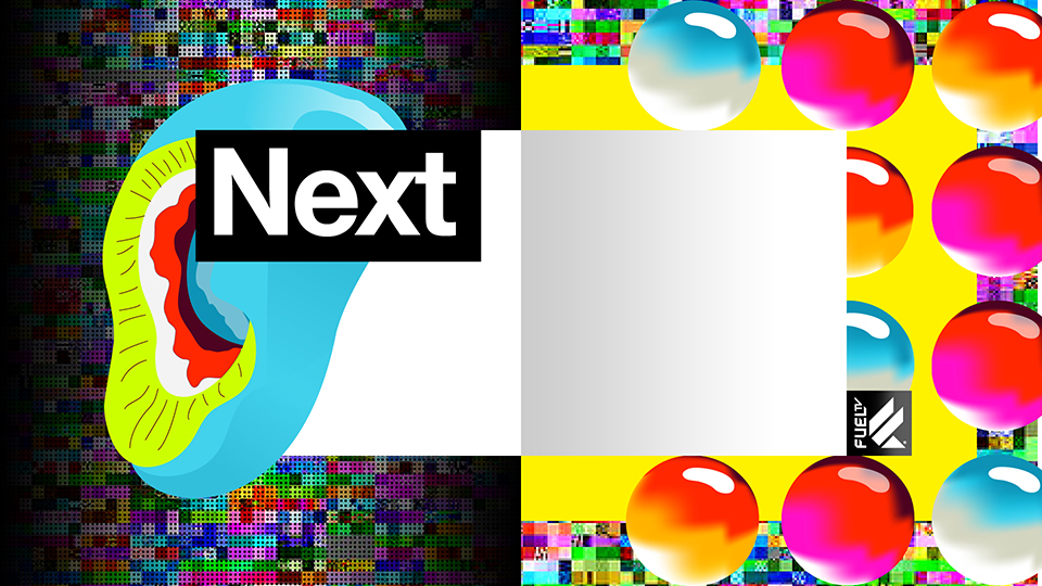
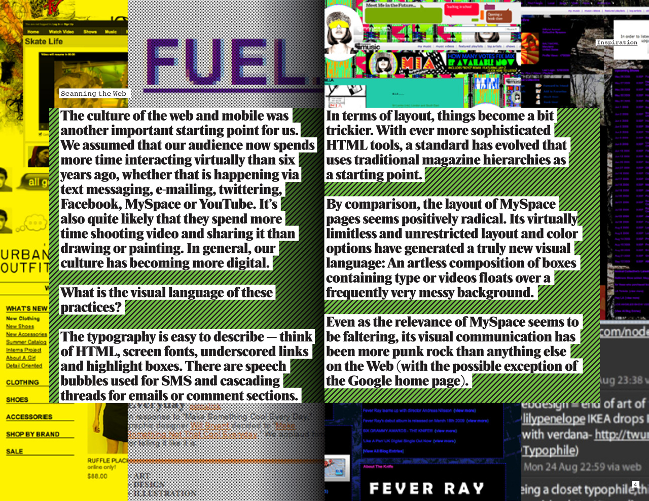
When I started to think about how to evolve the language of paint, doodles and Letraset-style type that dominated our 2003 design, my first instinct was to look at the Internet. It seemed that digital communication, media generation and consumption on computers and smart phones had developed and increased immensely since the launch, and had started to dominate the way teenagers make culture. I started gathering a mental lexicon of visual elements apparent on Google, YouTube and myspace.
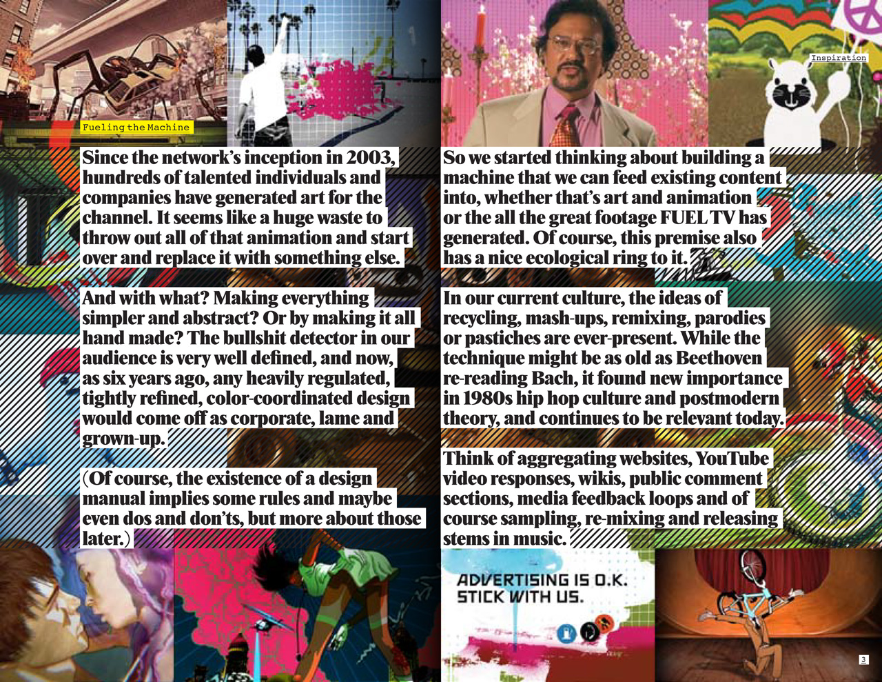
Conceptually, the new media landscape that teenagers navigate also tends to be referential rather than original in the orthodox sense. Videos are responded to with other videos, songs are covered by single musicians in their bedrooms, blogs are aggregators of other people’s content. In general, things get recontextualized, remixed and mashed up rather than made from scratch.
I also started feeling sorry for all the fantastic Fuel TV station IDs that we and other artists from all over the world made over six years. With a redesign like this, it’s inevitable that some or all of them would never be shown again. It seemed almost wrong to generate something new. It seemed right to recycle it.
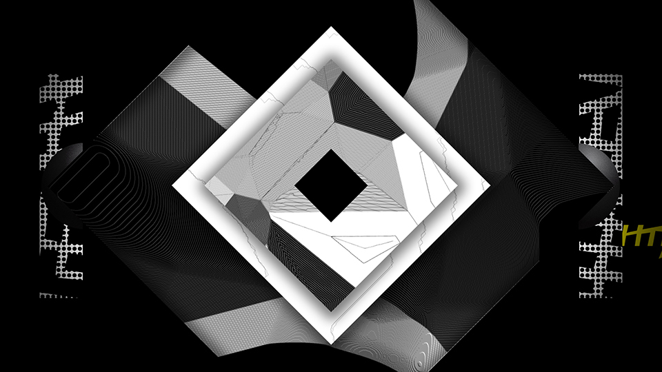
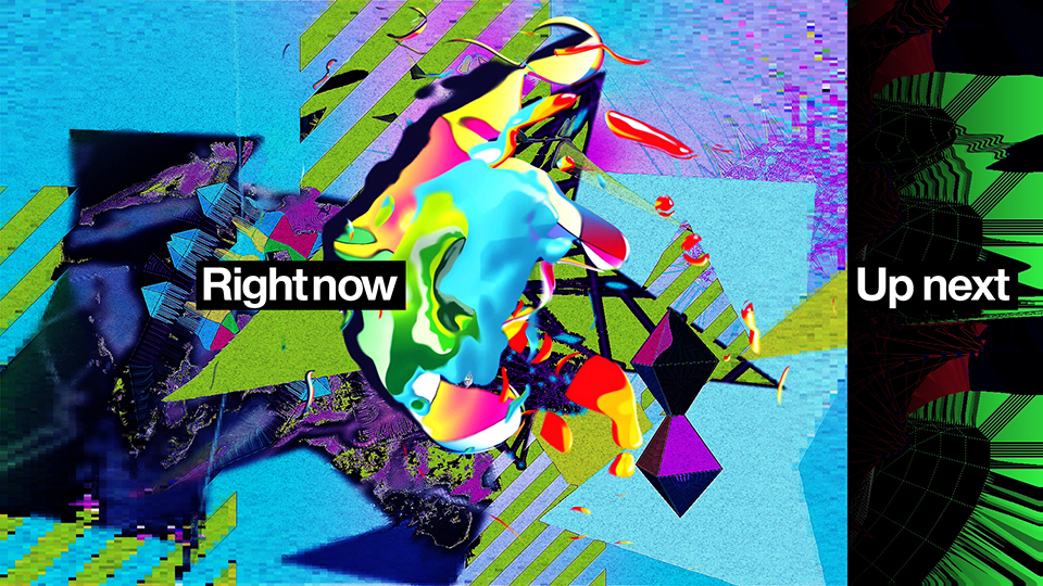
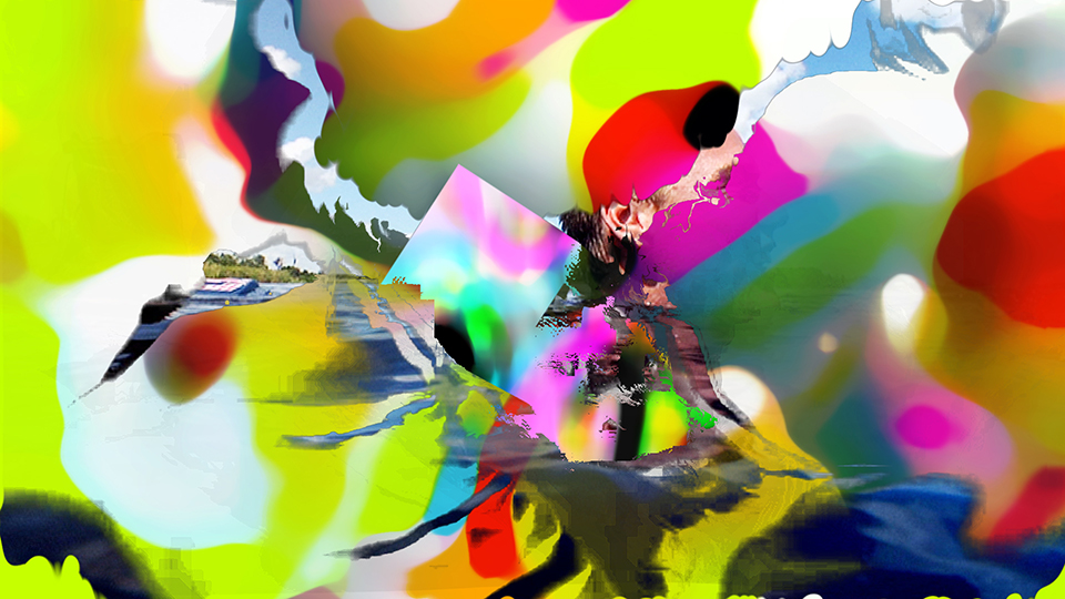
So we imagined to create a video machine that would — more or less automatically — generate new art when being fed old art: It would take all the old station IDs and to put them into a new context. In theory, this machine could be a software that made any video that is fed into it look like a piece of Fuel TV 2010 branding. Having been familiar with John Cage and Brian Eno’s observations on generative art for a long time, I’ve also always loved the whiff of laziness that comes with the concept.
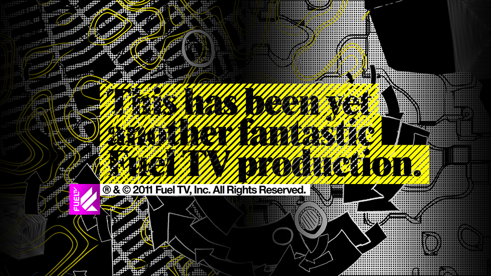
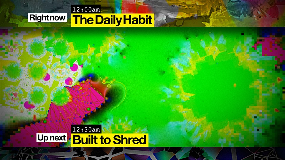
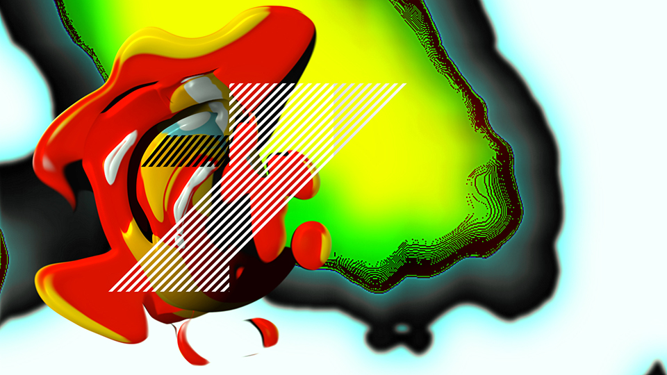
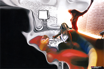
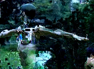
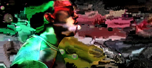
I quickly realized that such a software is in the best case too unpredictable and in the worst case utopian. Within the pressures of daily content production at a network, it’s completely unrealistic to expect producers and editors to make new art, even if it’s virtually self-generating. The solution for this dilemma was to make a huge amount of imagery that feels auto-generated but is, in fact, finite.
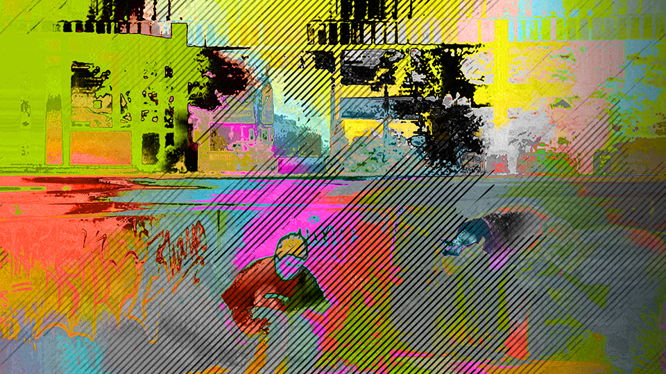
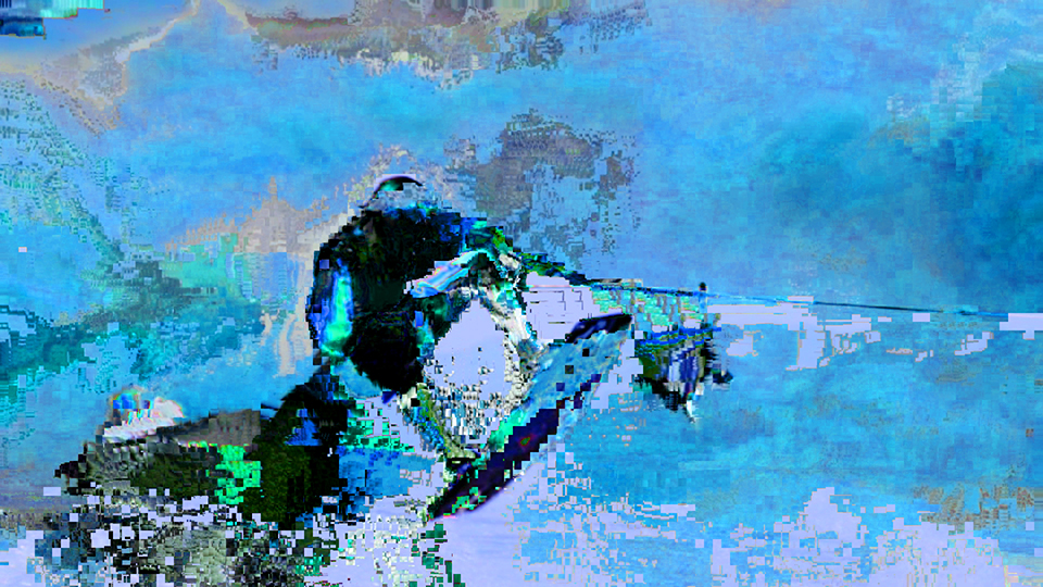
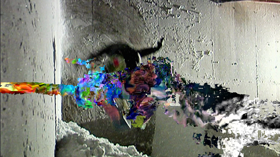
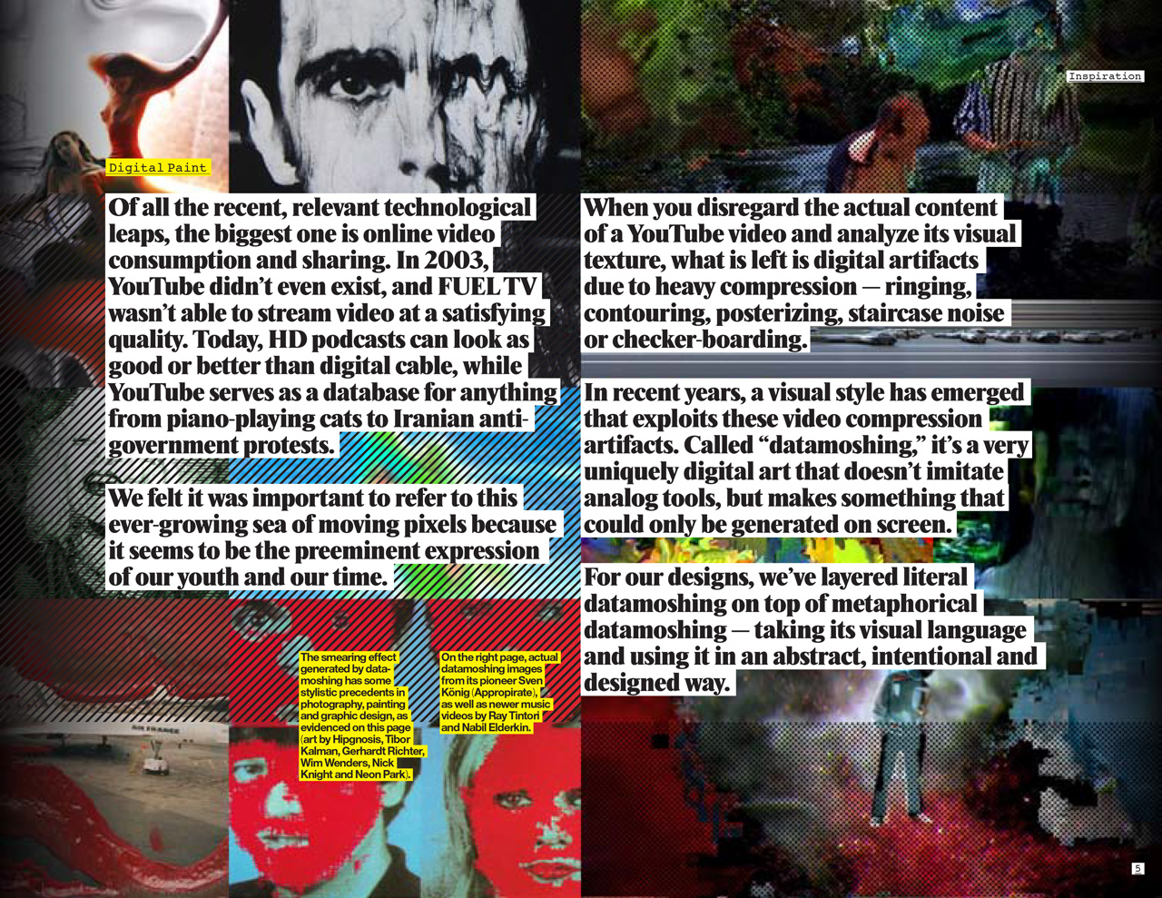
Searching for visual artifacts of the video age, I looked at datamoshing as well as some very few images we had created early on in the process, mainly using displacement and solarization techniques. As a literal technique itself, datamoshing has severe limitations and had been already a bit of a fad, but it inspired me to create our own visual language by design.
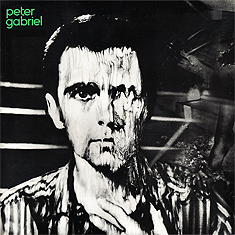
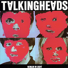

A few older images that reminded me of the visual language of datamoshing: Hipgnosis, “Peter Gabriel” (1980); HCL, JPT, DDD, WALTER GP, PAUL, C/T, “Remain In Light” (1980); Nick Knight, Pirelli Calendar (2003) and Gerhard Richter, “20. April ’05” (2005).
Datamoshing examples from its pioneer Sven König (Appropirate), as well as two music videos: Chairlift, “Evident Utensil”, directed by Ray Tintori (2009) and Kanye West, “Welcome to Heartbreak”, directed by Nabil Elderkin (2009).
At the suggestion of Eli Carrico, we found our machine in a man: Mark Kulakoff. Trained as a graphic designer at CalArts, he turned out to have a very unique sensibility and an odd set of tools to take any piece of video and turn it into something unrecognizable and irresistible. His handiwork is all over the package, and I never really wanted to know how he did things.
The framework for all of Mark’s video art was designed by me and animated by Trix Taylor. Just as the art’s initial visual inspiration comes from digital compression visible on web videos, the graphic design and typography follow the crudeness of HTML type and MySpace layouts. Another visual and conceptual inspiration was the stacking grid and cropping effect in Dutch designers Mevis & Van Deursen’s 2005 monograph.
Fuel TV 2010 Identity Vol.1/Promo & Digital (Montage/2:14)
Package for Competitions
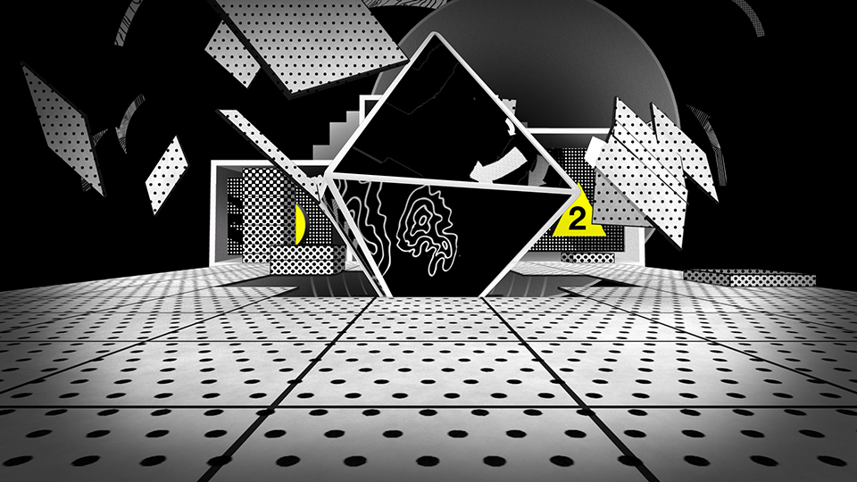
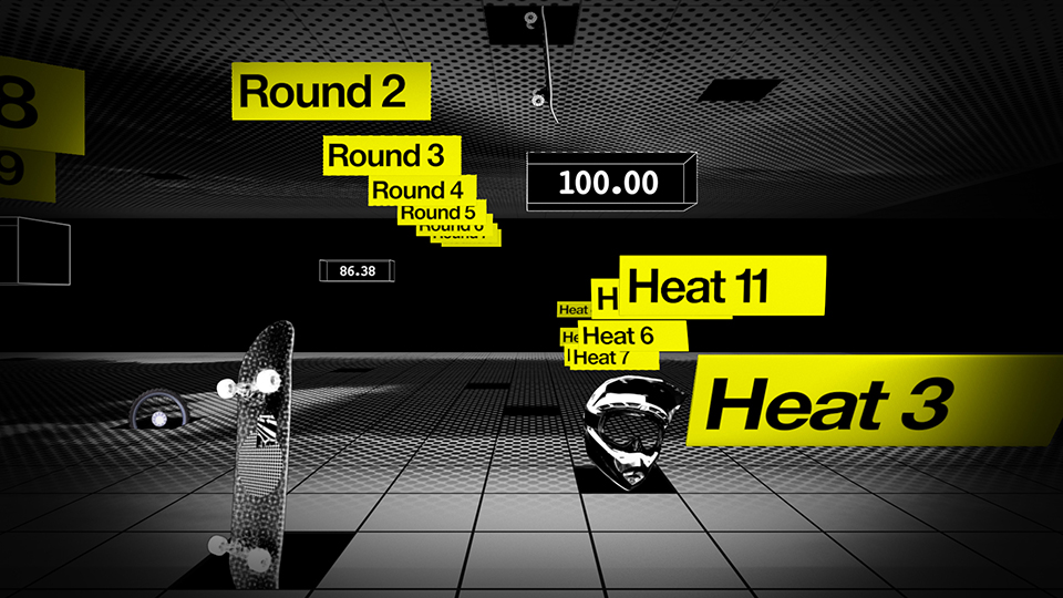
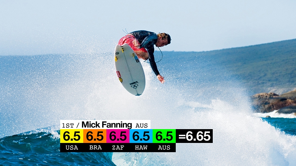
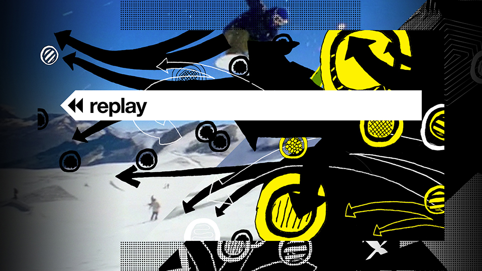
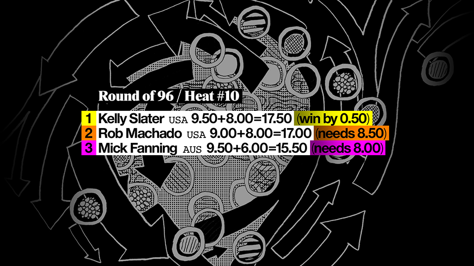
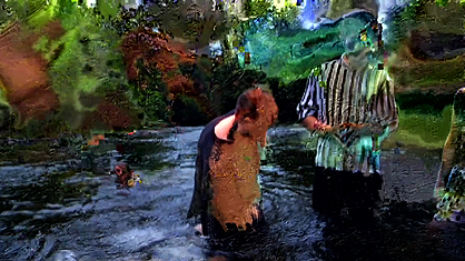
For all competition-related content, I devised a more orthodox methodology. Live or quasi-live sports coverage is by definition more raw and less processed than pre-produced programming, which is why it made sense to replace the machine-generated pixel paintings of the rest of the package with something man-made.
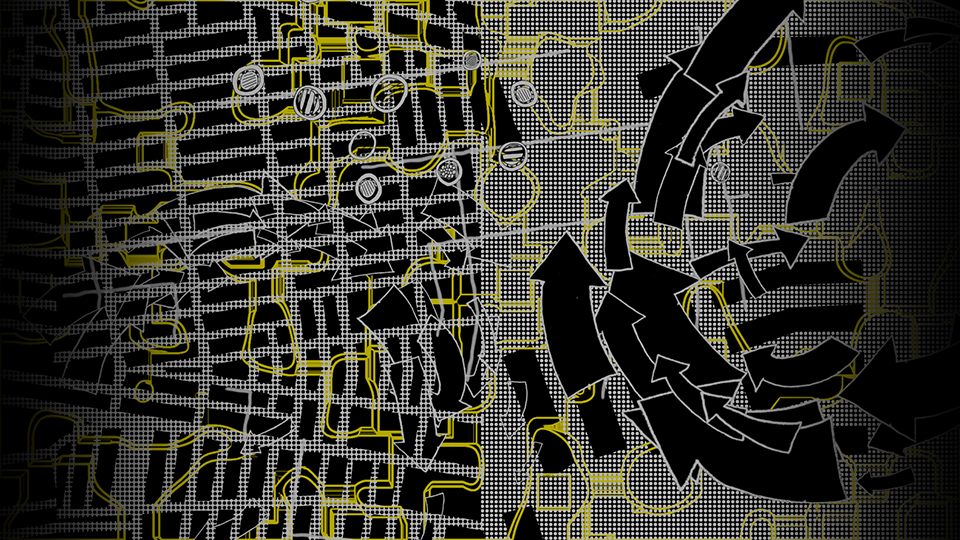
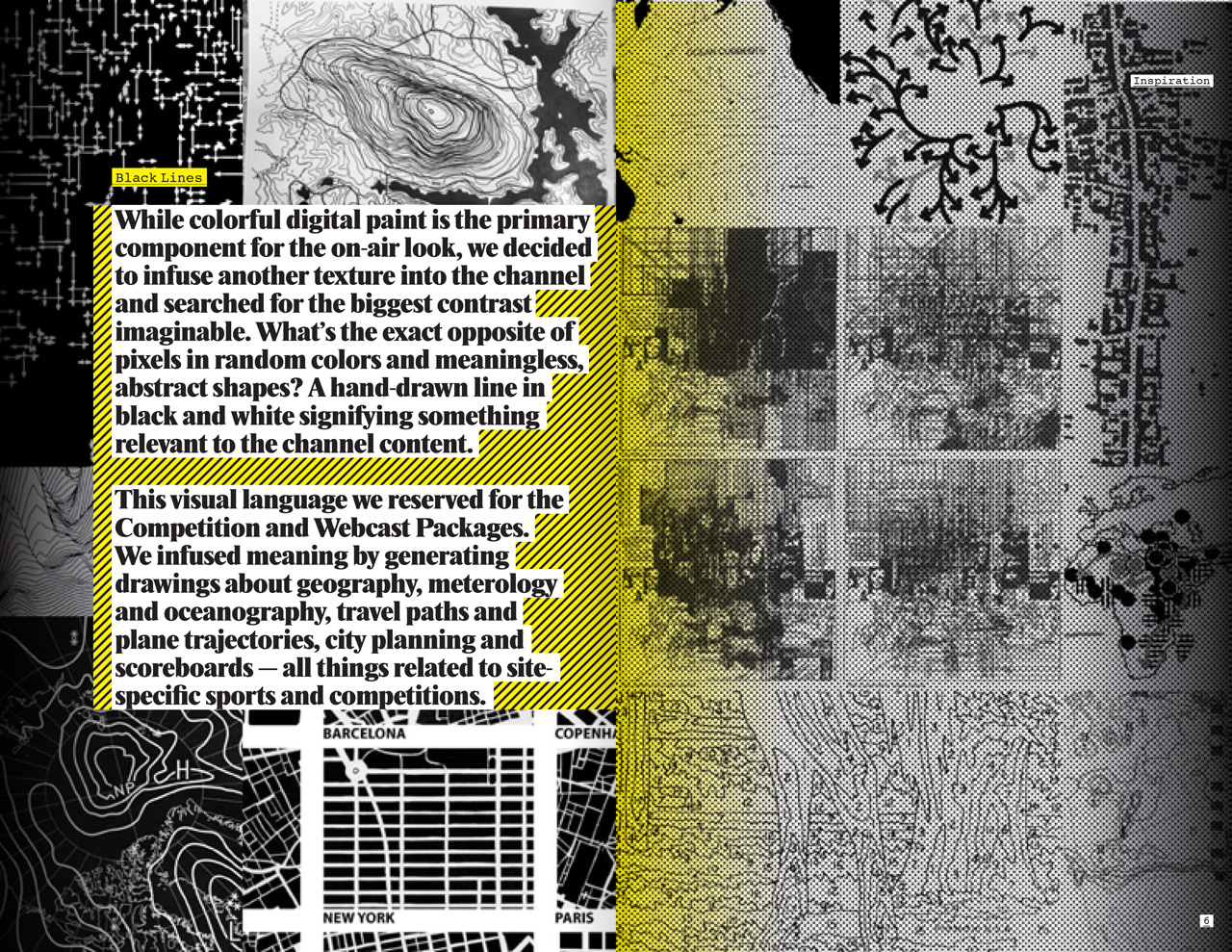
While the majority of the package concerns itself with texture rather than story, this part of the project is infused with meaning. Stressing that competitions in action sports are about traveling to and negotiating sites (rather than about winning and losing), we used visual material culled from geography, meteorology and urban planning.
Aspiring to the biggest contrast to our main package as possible, we opted for black-and-white line drawings and graphics, designed by Eli Carrico. Most of the artwork lives in the same framework as the main package, thus ensuring high consistency in spite of the visual and conceptual differences.
For all competition-related content, I devised a more orthodox methodology. Live or quasi-live sports coverage is by definition more raw and less processed than pre-produced programming, which is why it made sense to replace the machine-generated pixel paintings of the rest of the package with something man-made.
While the majority of the package concerns itself with texture rather than story, this part of the project is infused with meaning. Stressing that competitions in action sports are about traveling to and negotiating sites (rather than about winning and losing), we used visual material culled from geography, meteorology and urban planning.
Aspiring to the biggest contrast to our main package as possible, we opted for black-and-white line drawings and graphics, designed by Eli Carrico. Most of the artwork lives in the same framework as the main package, thus ensuring high consistency in spite of the visual and conceptual differences.
Fuel TV 2010 Identity Vol.2/Competition (Montage, 1:19)
Design Manual
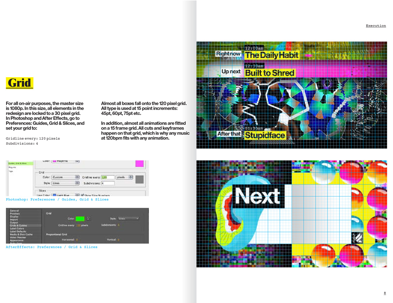
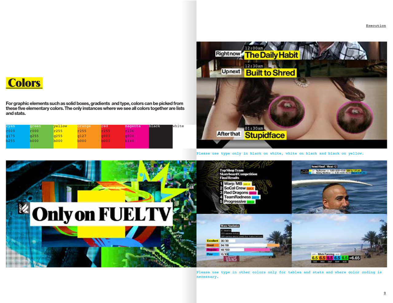
An on-air identity is a living, breathing thing that gets reinvented every day by the in-house team. I created seven manuals for all the various applications we had designed and animated: the promo, competition and generic show packages, the podcast and webcast packages, the web site and iTunes page design and an overview.
An on-air identity is a living, breathing thing that gets reinvented every day by the in-house team. I created seven manuals for all the various applications we had designed and animated: the promo, competition and generic show packages, the podcast and webcast packages, the web site and iTunes page design and an overview.
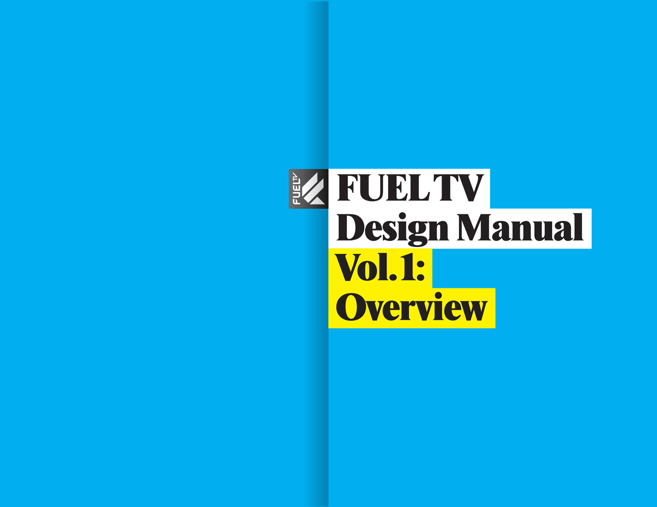

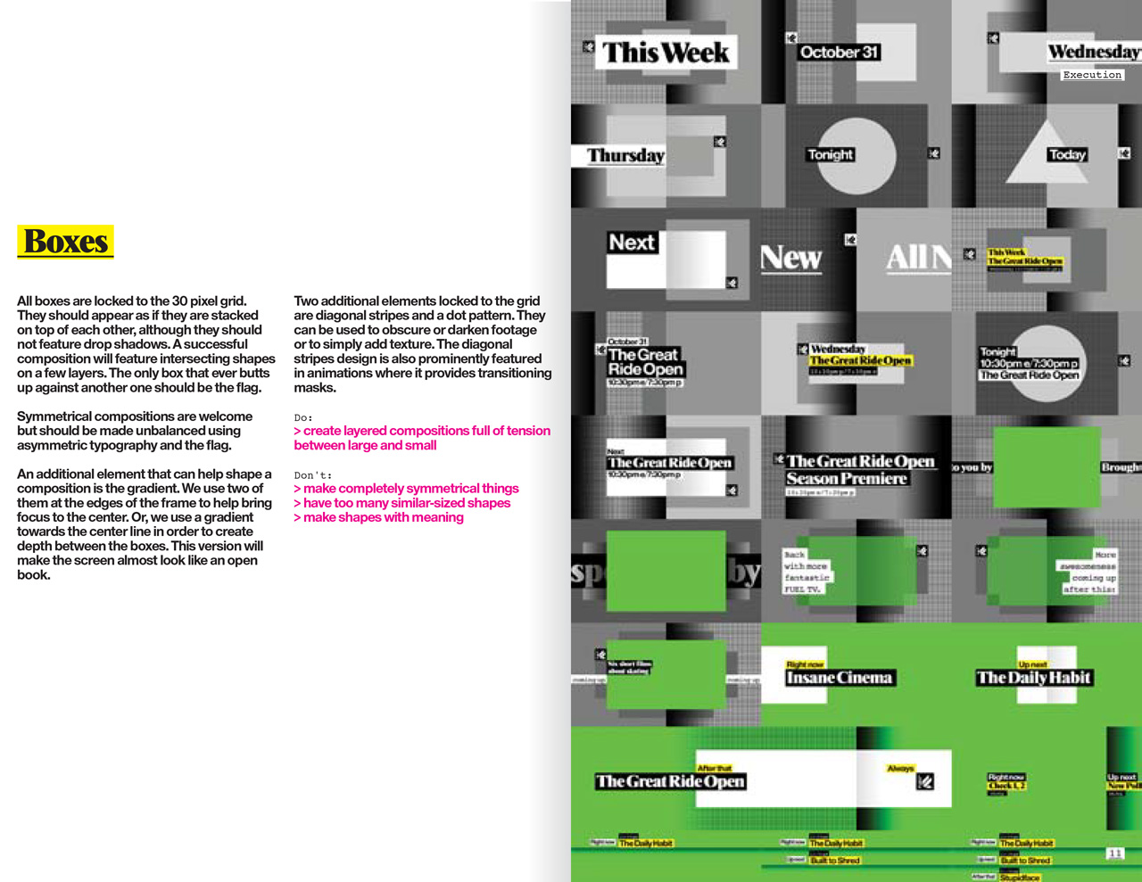
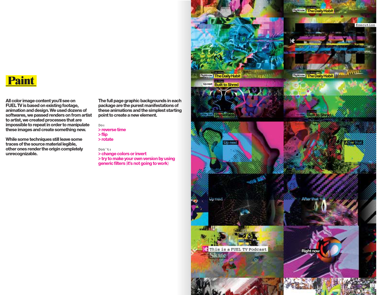
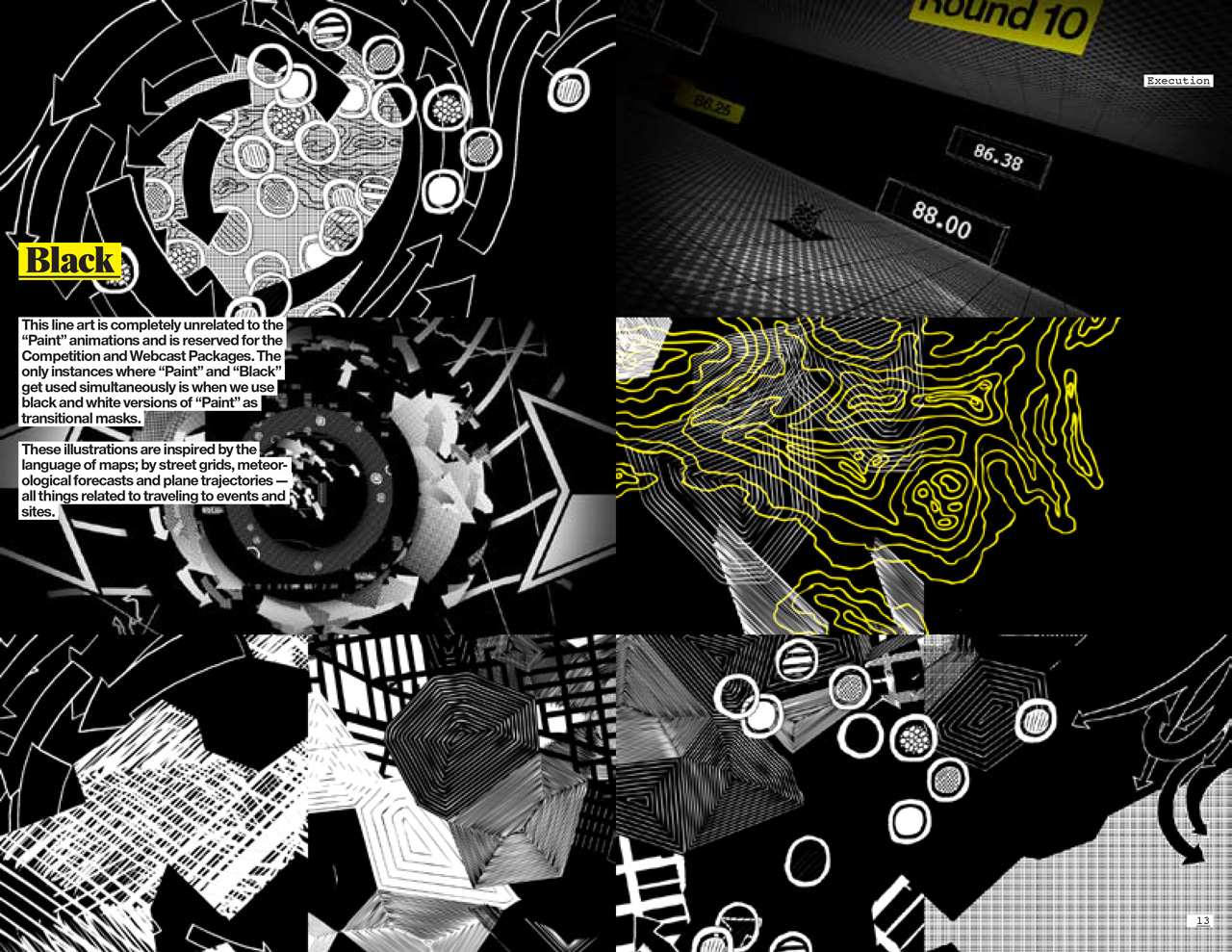
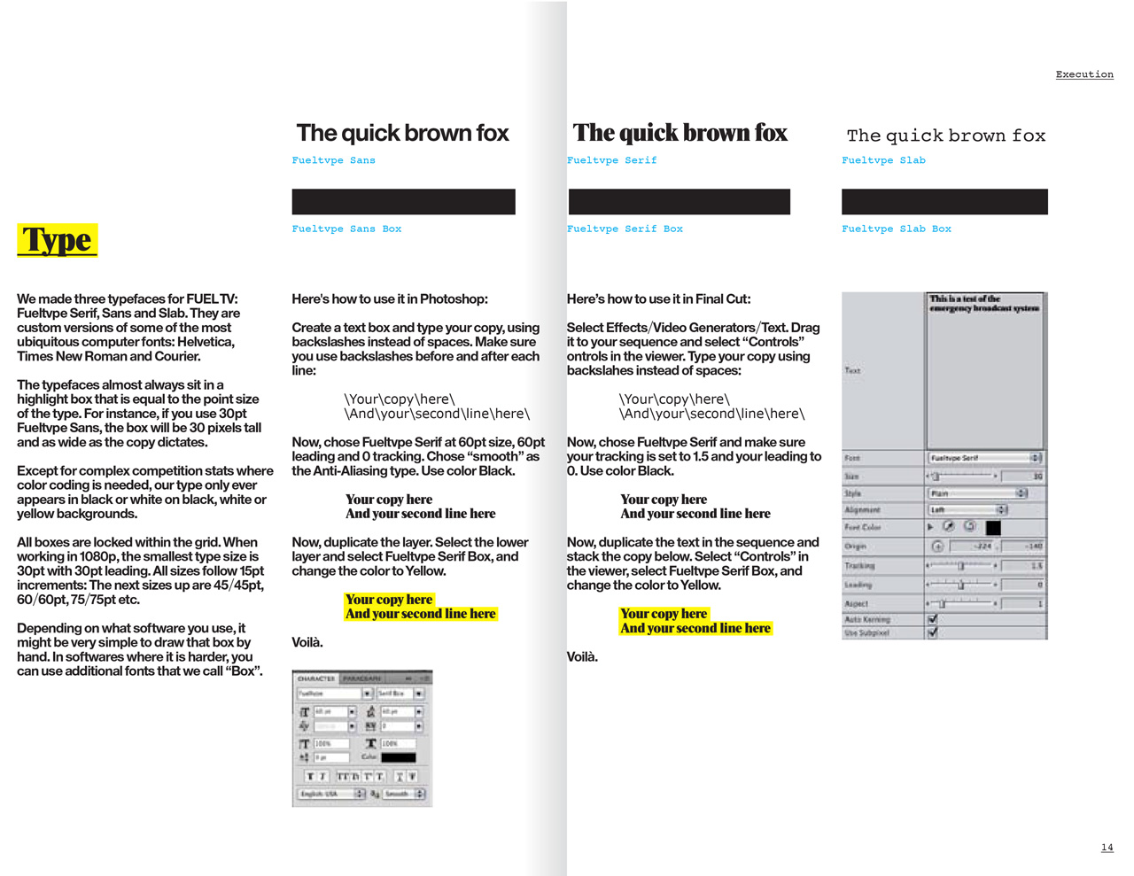
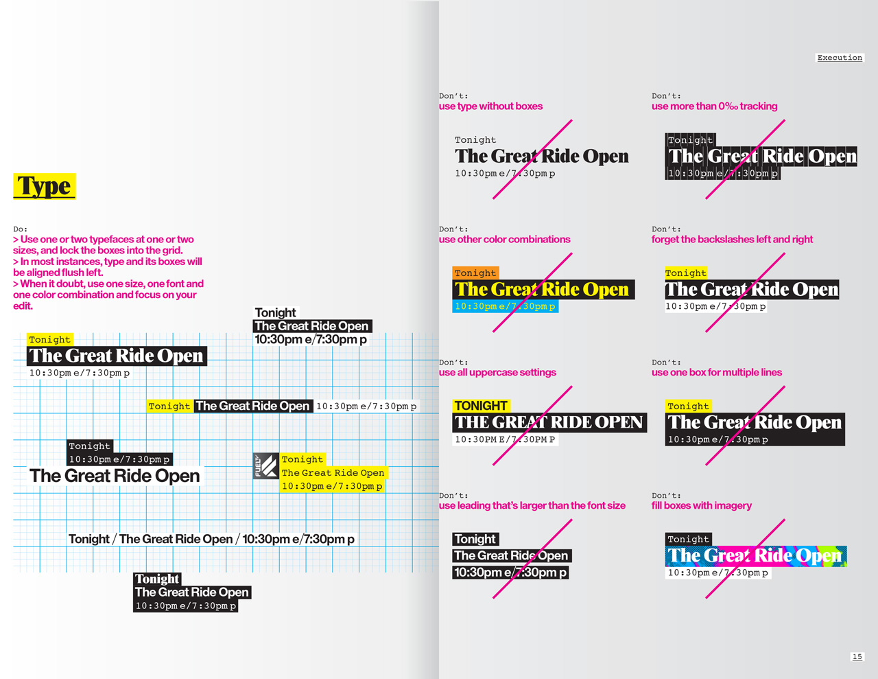
Pages from the design manuals.
Station Identifiers
In 2003, we invented the “free form film festival” way of making the Fuel TV station identifiers: Every ID could and should be completely different from the next one, and the only consistent element is the logo treatment in the end. In the six years since, many artists and companies have continued the tradition. In 2010, I and Brand New School picked it up again with ten new ones. I directed the “Board Breakers Anonymous” series, and co-creative directed the rest.
-----------------------------------
Client: Fuel TV, Los Angeles
Design & Production: Brand New School, Los Angeles
Creative Director & Designer: Jens Gehlhaar
Designer: Eli Carrico
Enossification: Mark Kulakoff
Lead Animator: Trix Taylor
Animator: Sam Sparks
Producers: Amy Russo, Craig Houchin
Music (on air): Machine Head, Venice Beach
Music (Montage Vol. 1): Animal Collective, “Summertime Clothes”
Music (Montage Vol. 2): M83, “Teen Angst”
For more Fuel TV:
Fuel TV 2010 Design Manual Vol.1: Overview (PDF download)
Fuel TV "Board Breakers Anonymous"
Fuel TV “Superskate”
Fuel TV “Motosutra”
Fuel TV 2003 Network Identity
For more network identities:
IMF The International Music Feed
VH1 Classic
MTV2