
VH1 Classic
Network Identity
DESIGNED & ANIMATED AT BRAND NEW SCHOOL, 2001
Network identities are great fun for designers in any case, but this project was even better. It was about Rock’n’Roll music, and it was about a part of print design history that hadn’t been properly explored yet, thus combining two of my biggest interests.
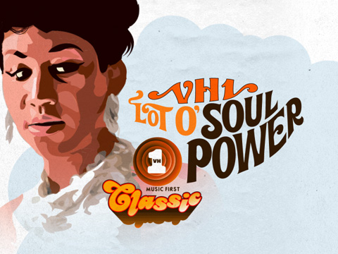
At the time of its launch, VH1 Classic was a 24-hour channel airing nothing but music made between the Sixties and the Eighties. It showed songs taken from feature films, promo videos, documentaries, TV shows and bootlegs. The programming consisted of ten different themes. The Sixties, Seventies and Eighties shows played music from a specific decade, while “Pop Show,” “Rock Fest,” “Soul Power” and “Metal Mania” covered specific genres. A show called “Headliner” featured one artist only, “Tuesday Twoplay” was VH1's version of back-to-back videos, and "All Star Jam" was a catch-all for any editorial configuration that wasn’t covered by the other nine themes.
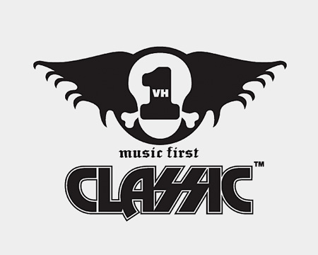
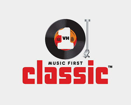
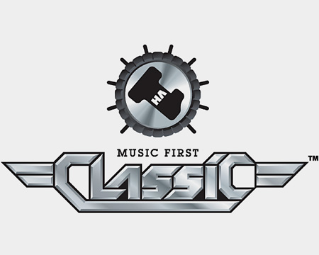
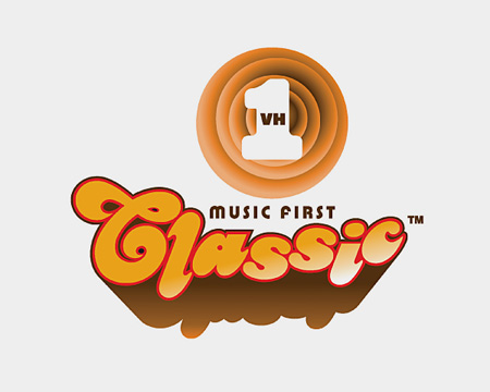
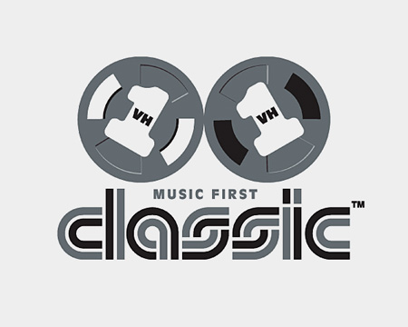
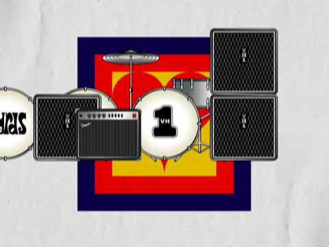
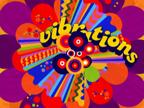
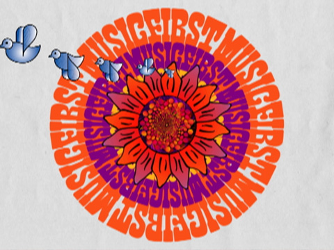
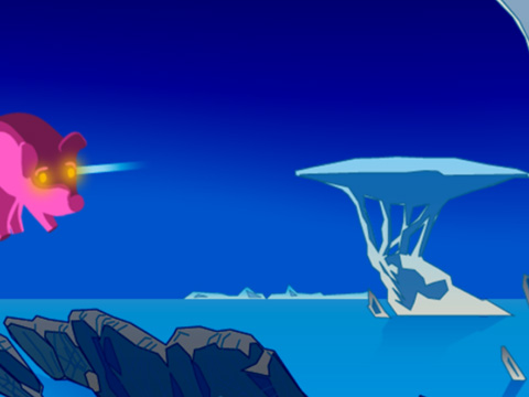
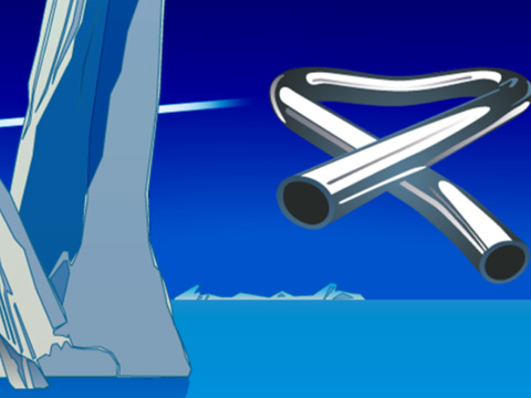
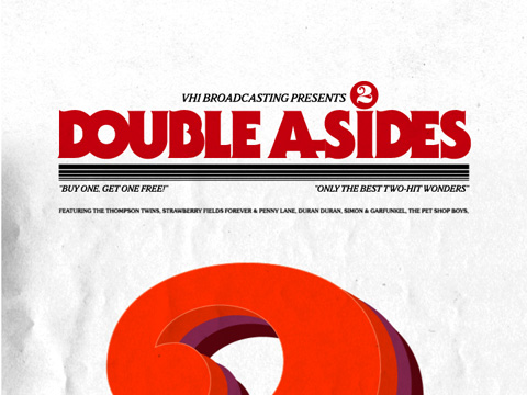
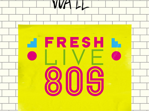
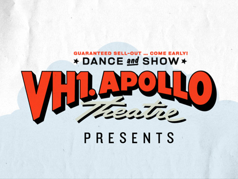
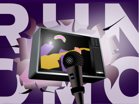
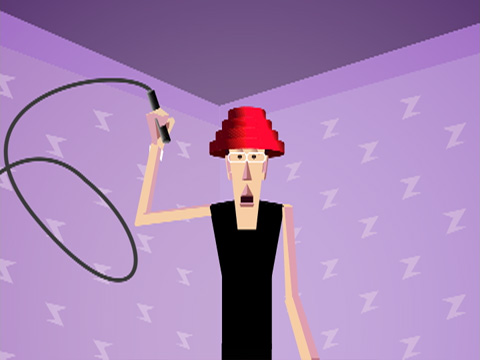
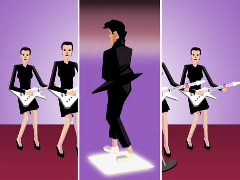
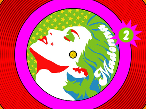
Nine of the network logo’s ever-changing expressions.
The project was a great opportunity for me to research the history of graphic design for rock music; from obvious sources like album covers and concert posters to more obscure ones like backstage passes and T-Shirts. It was very interesting to see how the best Rock’n’Roll records and the greatest musicians have frequently been represented by mediocre, sloppy or vernacular design; and that some canonized “high” design movements have never even dealt with rock music packaging. Another great aspect of this job was the irreverent and ironic attitude of both content and the client, which enabled some oblique puns to make the final cut.
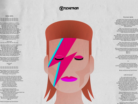
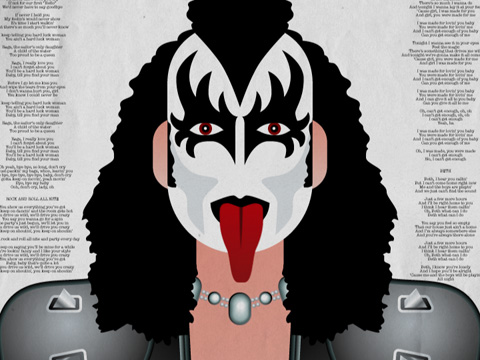
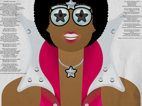
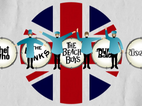
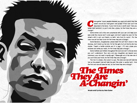
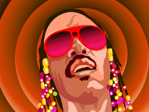
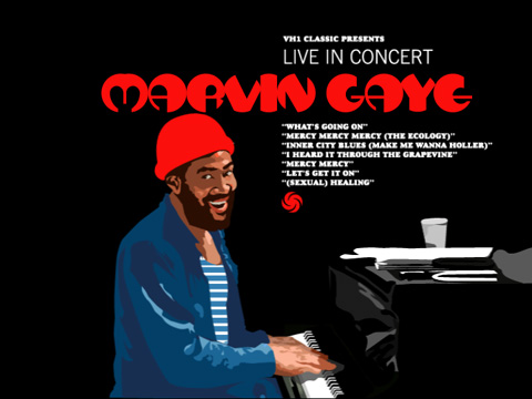
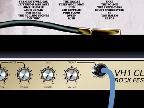
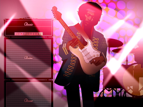
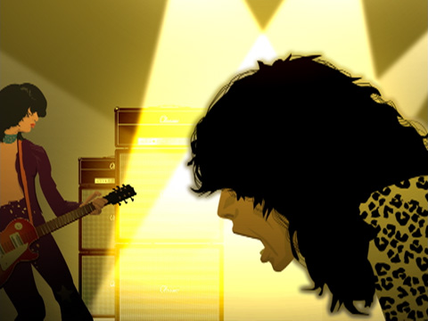
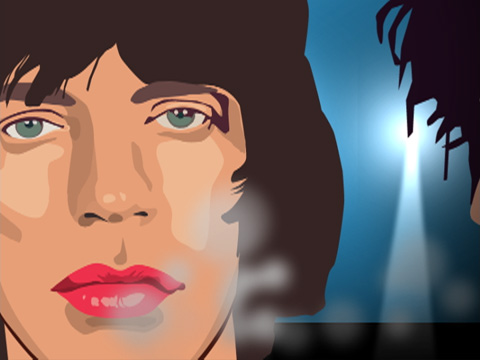
I was thrilled by the chance to appropriate some bad and obscure designs and make them our own, including work from the Eighties that hadn’t been plundered yet (remember, this project is from 2001). Early on, we decided to simply redraw everything, from headline type and iconic graphic elements to portraits of musicians. Using vector-drawing softwares, we interpreted still images that originally were photographed, airbrushed, water-colored, collaged or xeroxed. This way, we legally could reference and even directly quote specific sources and eras; and simultaneously give it an overlying aesthetic.
I was thrilled by the chance to appropriate some bad and obscure designs and make them our own, including work from the Eighties that hadn’t been plundered yet (remember, this project is from 2001). Early on, we decided to simply redraw everything, from headline type and iconic graphic elements to portraits of musicians. Using vector-drawing softwares, we interpreted still images that originally were photographed, airbrushed, water-colored, collaged or xeroxed. This way, we legally could reference and even directly quote specific sources and eras; and simultaneously give it an overlying aesthetic.
VH1 Classic Network Identity / Montage (2001/1:40)
We made up this aesthetic as we went along. In the process, authenticity and story-telling was always more important than to create something pretty. By avoiding retro clichés in favor of accurately referenced formal languages, and by animating images that originally were still, we arrived at something that feels simultaneously familiar and new.
The client was never even remotely interested in coherency. Every show open had its own story and its own look, reflecting the sometimes broad scope of content. In addition, every show received its own version of the VH1 Classic logo. The only unifying strategy was to start each open by scrolling down a printed poster that announces an event. The audio for all of these spots is a collage of musicians, announcers and audiences warming up for a great show.
The client was never even remotely interested in coherency. Every show open had its own story and its own look, reflecting the sometimes broad scope of content. In addition, every show received its own version of the VH1 Classic logo. The only unifying strategy was to start each open by scrolling down a printed poster that announces an event. The audio for all of these spots is a collage of musicians, announcers and audiences warming up for a great show.
Three of the block opens that I storyboarded and illustrated myself:
VH1 Classic “Sixties Generation” (2001/0:19),
VH1 Classic “Super Seventies” (2001/0:20) and
VH1 Classic “We Are the Eighties” (2001/0:23)
Looking back to it more than two decades later, the project was quite the hotbed/springboard for the Westcoast motion graphics community. Among the contributors were Brian Won, Brumby Boylston, Chris Dooley and Jared Libitsky (who went on to form National Television and, in Brian’s case, Buck), Jake Banks and Matthew Marquis (who would go and form Stardust and, later, Golden LA), Arya Senboutaraj and Bucky Fukumoto (who would go on to Logan and The Directors Bureau), Saiman Chow, Ben Go and, last but not least, Jonathan Notaro of Brand New School.
----------------------------------------
Client: VH1 Networks, New York
Design & Production: Brand New School, Los Angeles
Creative Director & Designer: Jens Gehlhaar
Lead Illustrators & Cel Animators: Saiman Chow, Brian Won, Jens Gehlhaar
Designers: Jonathan Notaro, David Vegezzi, Dennis Go, Jake Banks, Pete Bergeron, Arya Senboutaraj
Lead animators: Brumby Boylston, Trix Taylor, Ben Go, Calvin Lo
Additional animators: Shell Blevinns, Dennis Go, Arya Senboutaraj, Lisa Packel, Cameron Walser, Chris Dooley, Sean Dougherty
Producer: Jared Libitsky
Music (Montage only): Beach Boys, “Good Vibrations”
Awards:
81st AD Annual Awards (Gold)
AIGA “Grown in California” 2004
For more network identities:
IMF (The International Music Feed) Identity
Fuel TV 2003 Identity
Fuel TV 2010 Identity
MTV2 Identity