
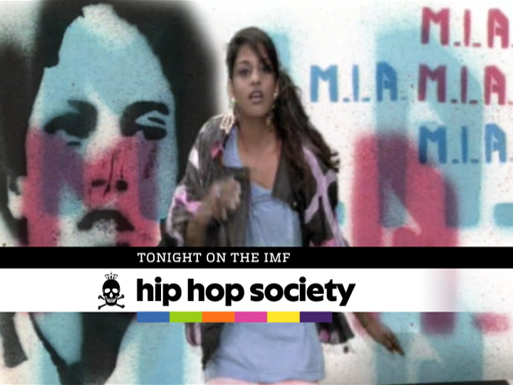


IMF
The International Music Feed
Network Identity
DESIGNED AND PRODUCED AT BRAND NEW SCHOOL, 2005
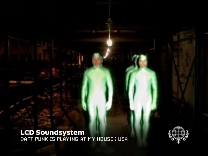
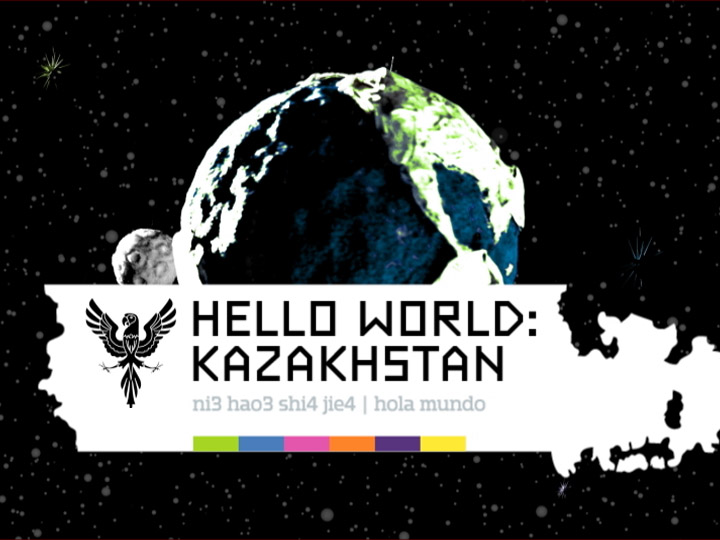
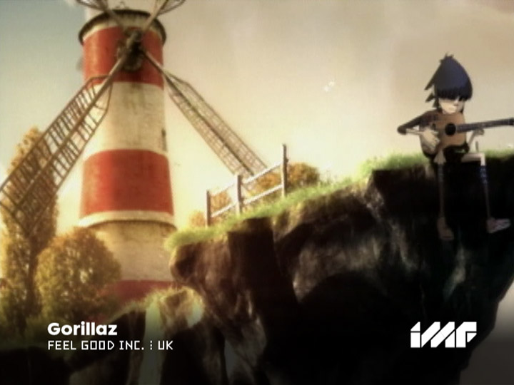
Created by the Universal Music Group, IMF was the first 24 hour music channel to combine the best music from the U.S. with great music from all over the world. Brand New School created the entire identity — from logo and type design to show packages and live action station IDs. In 2008, the channel was purchased and replaced by Ovation TV.
The branding for IMF raised one of the core questions that has been facing outlets like MTV or Rolling Stone Magazine for decades: How do you negotiate the tension between well-packaged corporate pop culture and the dangerous subversiveness of new ascending waves?
In addition, the branding for IMF had to tackle another contradiction: While the channel showed music from all over the world, including a huge variety of regional national styles, there is also a global pop culture showing an amazing level of homogeneity — B-Boys dress the same everywhere, be it Dakar, Osaka or Brooklyn.
At the beginning of the project, I created a “What If?” document for the team, asking a few dozen questions: What if IMF was an internationally sanctioned entity such as the United Nations or the Olympic Games? Or what if IMF looked rather like a non-national or transnational entity operating outside of international law, such as pirate stations or smuggler rings? What if we took the graphic languages of maps and music and looked at the commonalities? Or what if we looked at the disparities: Isn’t music creating non-physical events over a time span, and aren't maps describing spatial and physical relationships?
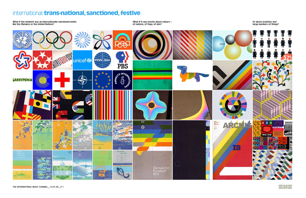
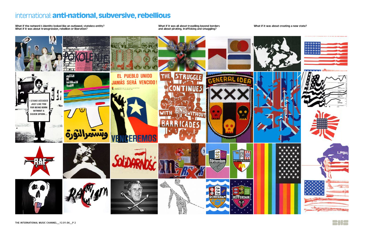
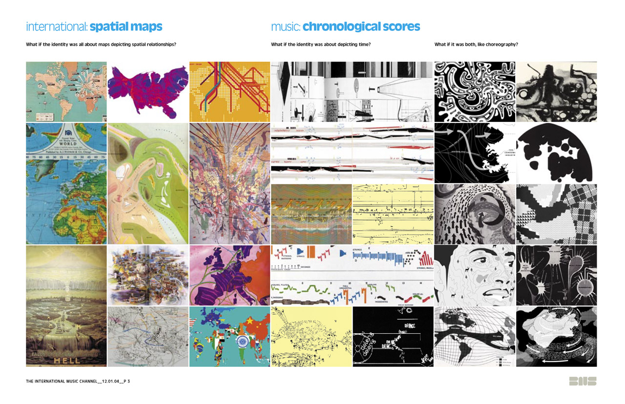
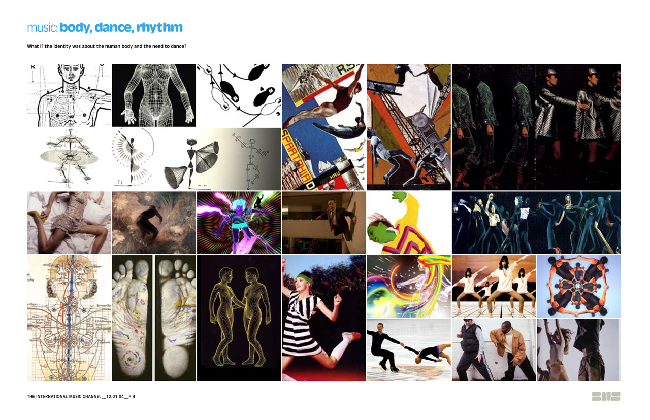
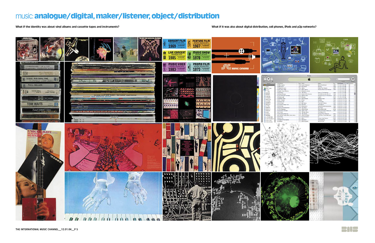


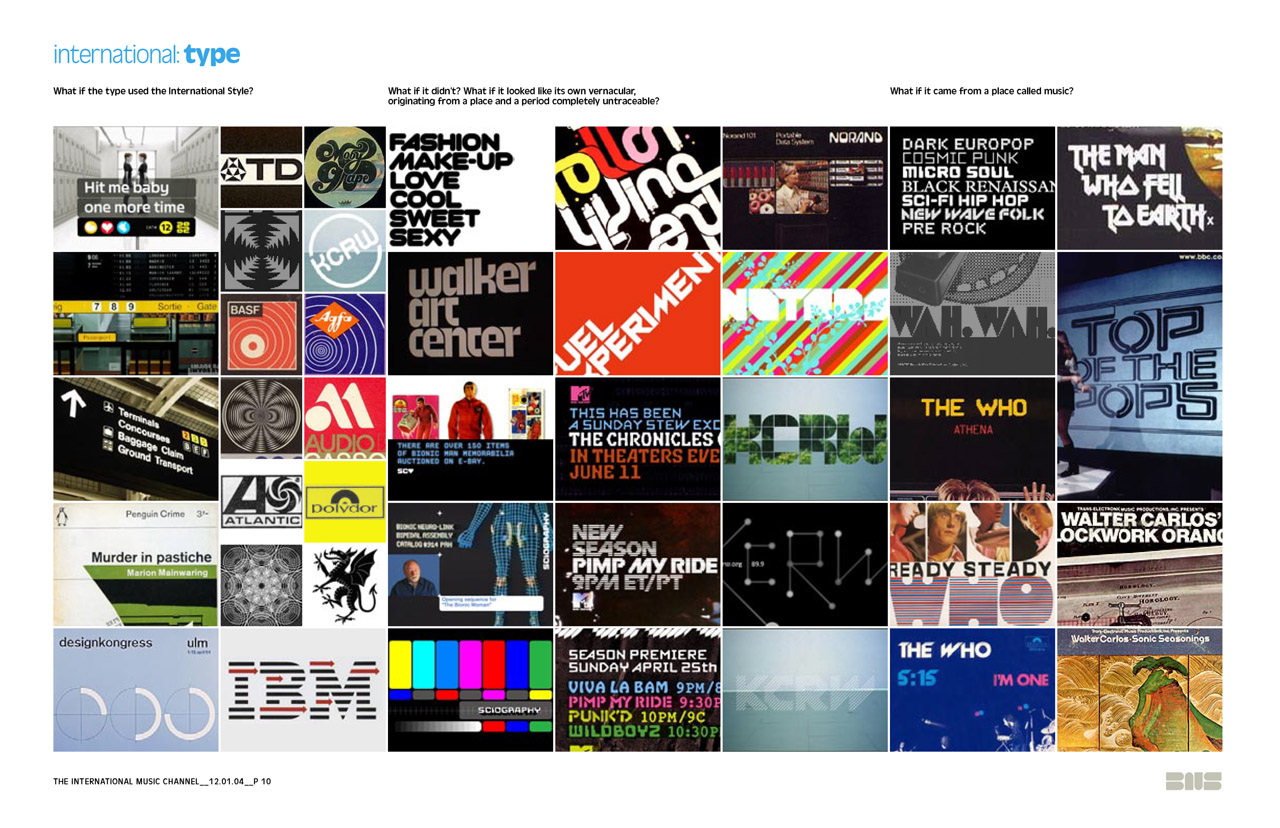
A few pages from the “What If” document
From this document, I took the most interesting conceptual and visual approaches and applied them to the layers of elements: logo, colors, iconography, typography and illustrations.
The Logo
For a television network, the logo’s main role is of course the bug in the corner of the screen. Since the channel and its name were brand new, it quickly became clear that it needed a type mark using the letters IMF rather than a picture mark. One of the final logos used letter shapes with curves and loops that alluded to melodies, dancing or even musical notation, but also carried connotations of non-latin alphabets. The logo that was eventually chosen has the cleanliness and gravity of a corporate mark, but shows also — due to its angular shapes and stenciled structure — influences of street cultures and punk rock.
From this document, I took the most interesting conceptual and visual approaches and applied them to the layers of elements: logo, colors, iconography, typography and illustrations.
For a television network, the logo’s main role is of course the bug in the corner of the screen. Since the channel and its name were brand new, it quickly became clear that it needed a type mark using the letters IMF rather than a picture mark. One of the final logos used letter shapes with curves and loops that alluded to melodies, dancing or even musical notation, but also carried connotations of non-latin alphabets. The logo that was eventually chosen has the cleanliness and gravity of a corporate mark, but shows also — due to its angular shapes and stenciled structure — influences of street cultures and punk rock.


For IMF’s color palette, I went straight to Otl Aicher’s identity for the 1972 Olympic Games, with hot pink thrown in for good measure. The festive quality of a rainbow of colors obviously underscored the idea of a celebration of world wide culture. It also enabled us to playfully color-code different parts of the network: While network-wide applications only used the colors as accents in primarily silver environments, for individual shows single colors were vibrantly featured.

The 1972 Olympic Games color palette.
The Icons
We developed a set of black and white icons that served as a counterweight to the serene, modern and festive part of the identity: Mythical creatures, ancient navigational objects, spiritual iconography — the sort of thing people have as tattoos, taken from an eclectic array of world cultures. They are codes that speak to the desire of subcultures to conserve the exclusivity of their tribe, which of course is an important trait in popular music as well.
We developed a set of black and white icons that served as a counterweight to the serene, modern and festive part of the identity: Mythical creatures, ancient navigational objects, spiritual iconography — the sort of thing people have as tattoos, taken from an eclectic array of world cultures. They are codes that speak to the desire of subcultures to conserve the exclusivity of their tribe, which of course is an important trait in popular music as well.
Three of my typefaces were used for the channel's general typography. One is an extrabold sans serif with the optimistic geometry of Avant Garde or Futura — published in 2019 as FF Neuwelt —, one is a slab serif with a strangely futuristic modularity called Precrime Serif. Apart from the usual requirements of menus and announcements, the typography for a music video channel also includes video credits, for which I developed a third typeface called Chyron on a simple grid designed to work within the constraints of DV-compressed NTSC.


Sketches for Rover (later published as FF Neuwelt); specimen for Rover, Precrime and Chryon; and Chyron in use.
The Illustrations
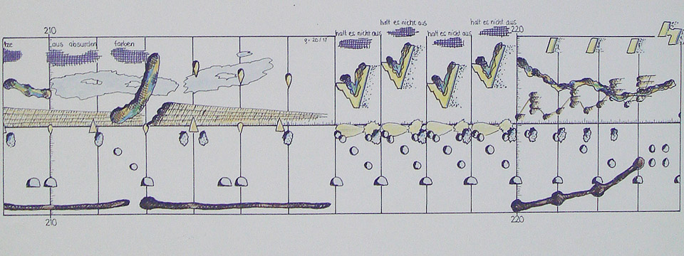
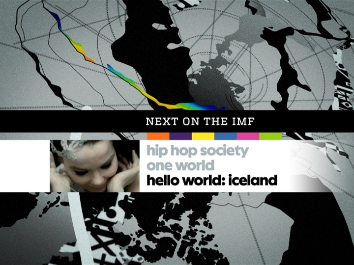
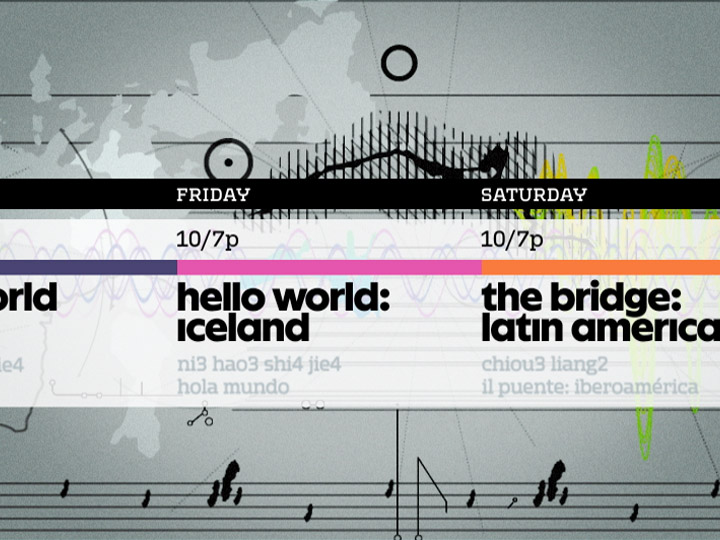
A set of poetic and graphic illustrations is used for all network-wide packaging. The imagery finds correlations between maps and music, between space and time, between the path of a traveller and the melody of a guitar solo, and between the rotation of the earth and that of a turntable. I majored in music in high school, and I've been fascinated by graphic notation ever since.
A set of poetic and graphic illustrations is used for all network-wide packaging. The imagery finds correlations between maps and music, between space and time, between the path of a traveller and the melody of a guitar solo, and between the rotation of the earth and that of a turntable. I majored in music in high school, and I've been fascinated by graphic notation ever since.
Left: Detail from a poster for one of my bands (1986).
Right: A grad school project called “Cyber-Ballad”, an app to deconstruct various remixes
and versions of Björk’s song “Hyper-Ballad” (1996).
For the IMF illustrations, created by Clarissa Tossin, each image is paired with a distinct camera movement: We track along the score, fly over the continents, we zoom into the city, we watch the pole turn.


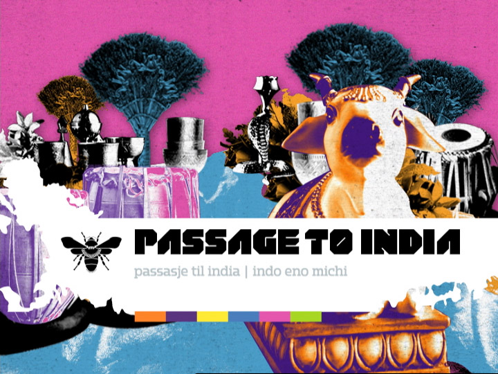
The photographic component was used exclusively for show packages. Hand-colored, gritty and grainy, it served as a counterweight to the clean vectors, fluid animations and faux-corporate air of the illustrations. Compared with the majestic, sweeping scale of the illustrations, the photographic imagery used mostly table top-size objects. Some of the animation was captured in-camera, some of it was stop motion, some of it was animated in After Effects.
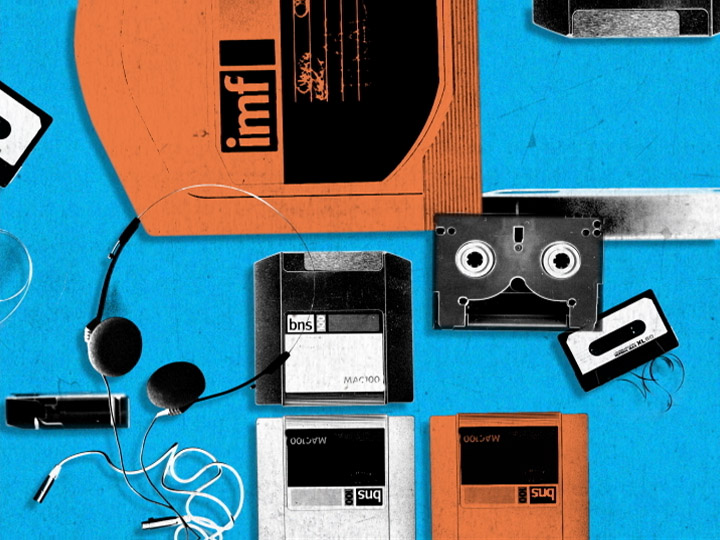

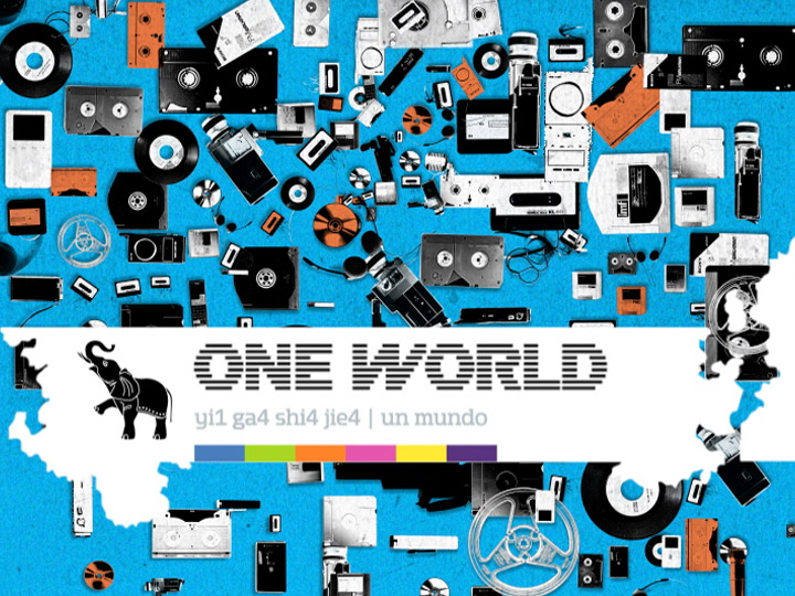


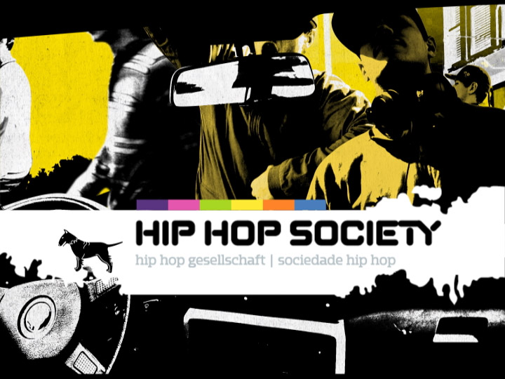


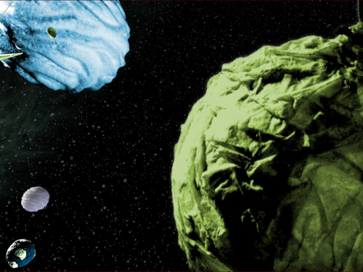
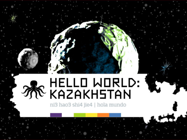
And here is how a few hours on the channel looked like, condensed into a minute:
Client: Universal Music Group, Los Angeles
Design & Production: Brand New School, Los Angeles
Creative Director & Designer: Jens Gehlhaar
Creative Director & Designer: Jonathan Notaro
Lead Illustrator: Clarissa Tossin
Designers: Rob Feng, Max Erdenberger, Andrew Bernet, Tim Koh
Animators: Dickson Chow, Kyu Kim, Trix Taylor, Andy Kim, Cameron Walser, Mark Kim, Sang-Hoon Lee, David Miller, Wonhee Lee, Peter Murphy
Photographer: Ian Brook
Producer: Jared Libitsky
Music: Echo Park, Los Angeles
For more IMF:
IMF “Folklore Airport” & “Alien Forest”
For more network identities:
VH1 Classic Identity
Fuel TV 2003 Identity
Fuel TV 2010 Identity
