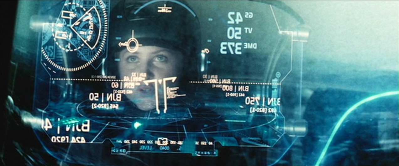


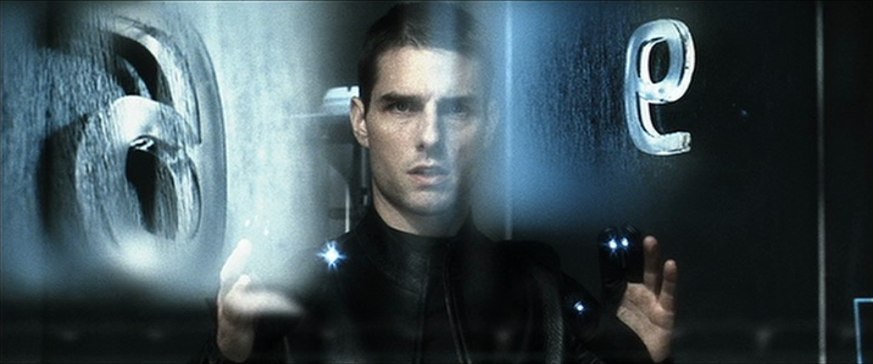
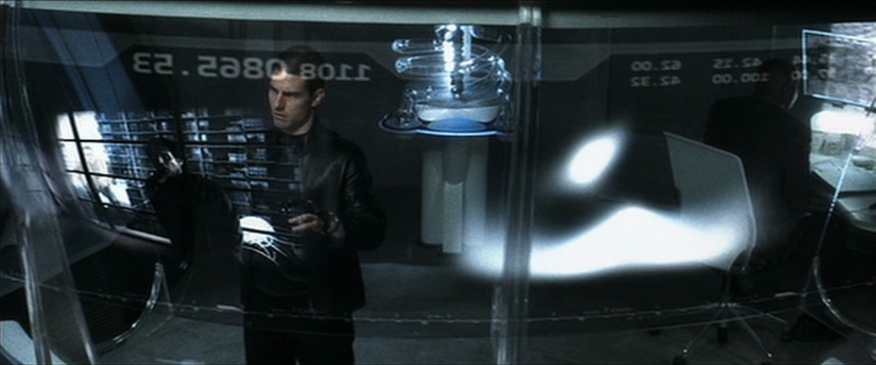
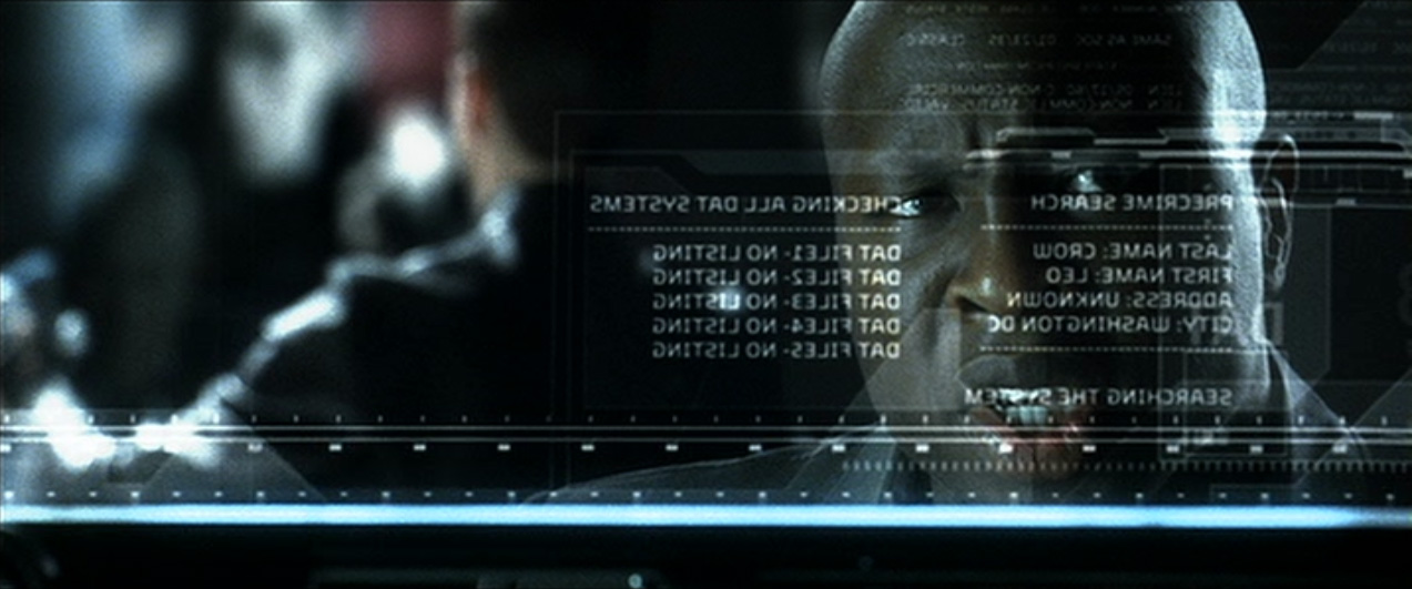
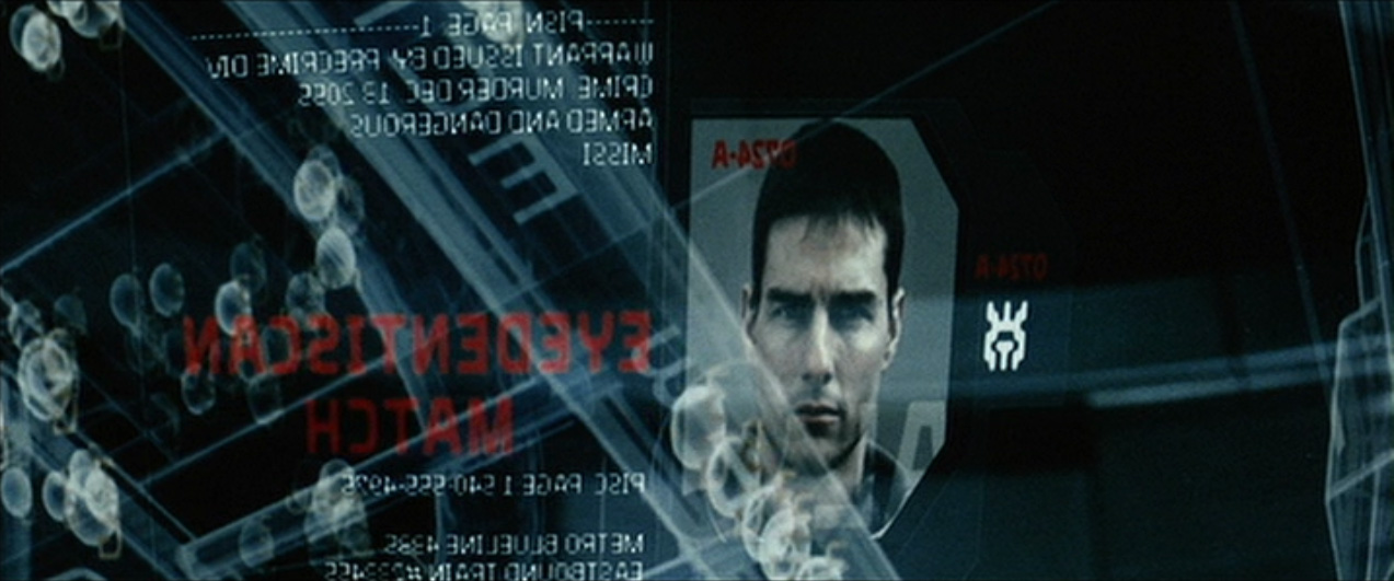
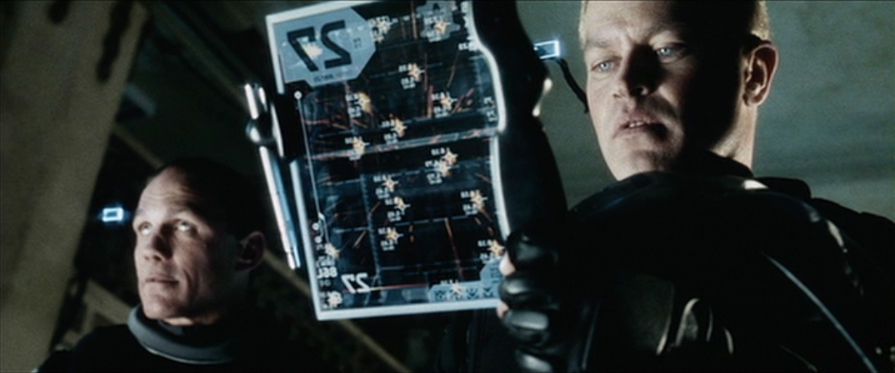

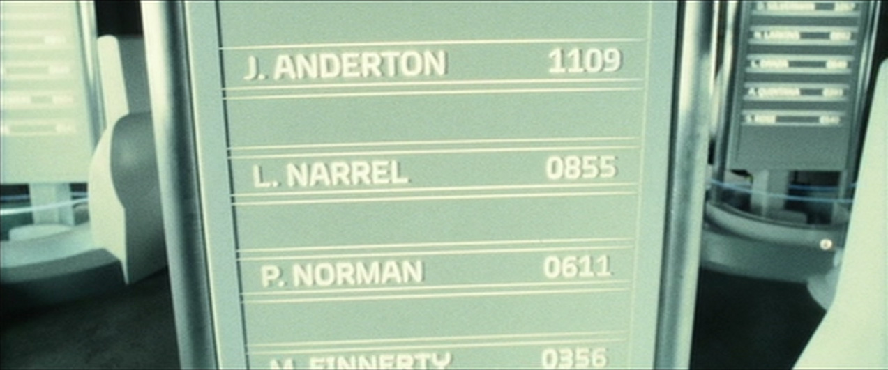
How it looks like in the movie.
“Minority Report”
DESIGNED 2001
Alex McDowell is one of the most forward-thinking production designers working in features today. His art departments are well-known for the use of digital technology and the seamless integration of assets between previz, the camera department and post production. More than two decades after its release, the McDowell-designed movie Minority Report provides constant reference points in interactive media and film making alike, the most notorious of which is the gestural interface.
But Alex also has a very impressive graphic design background, and he commissioned from me a custom typeface as part of the corporate identity of Precrime, the crime prevention organization central to the Minority Report story. The corporate identity was developed by graphic designer Dianne Chadwick; and applied by the art department as well as outside vendors responsible for the motion graphics, most notably Imaginary Forces’ work on Precrime’s interfaces.
The typeface was derived from Dianne’s sketch for the Precrime logo, and built into three full weights in sans, semiserif and serif versions. The design is an ironic reaction to, but also a serious extrapolation of the ridiculous ubiquity of Eurostile in science fiction films.
While it should be mandatory for the designers of science fiction films to not only develop new architecture, vehicles, costumes and hair styles, but also typefaces, this is one of the only instances where this has actually happened. More than a decade later, Dianne and I collaborated again on a typeface for a Tom Cruise movie.
Custom typeface for
“Minority Report”
DESIGNED 2001
Alex McDowell is one of the most forward-thinking production designers working in features today. His art departments are well-known for the use of digital technology and the seamless integration of assets between previz, the camera department and post production. More than two decades after its release, the McDowell-designed movie Minority Report provides constant reference points in interactive media and film making alike, the most notorious of which is the gestural interface.
But Alex also has a very impressive graphic design background, and he commissioned from me a custom typeface as part of the corporate identity of Precrime, the crime prevention organization central to the Minority Report story. The corporate identity was developed by graphic designer Dianne Chadwick; and applied by the art department as well as outside vendors responsible for the motion graphics, most notably Imaginary Forces’ work on Precrime’s interfaces.
The typeface was derived from Dianne’s sketch for the Precrime logo, and built into three full weights in sans, semiserif and serif versions. The design is an ironic reaction to, but also a serious extrapolation of the ridiculous ubiquity of Eurostile in science fiction films.
While it should be mandatory for the designers of science fiction films to not only develop new architecture, vehicles, costumes and hair styles, but also typefaces, this is one of the only instances where this has actually happened. More than a decade later, Dianne and I collaborated again on a typeface for a Tom Cruise movie.
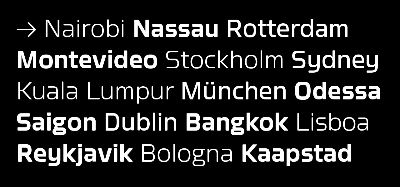
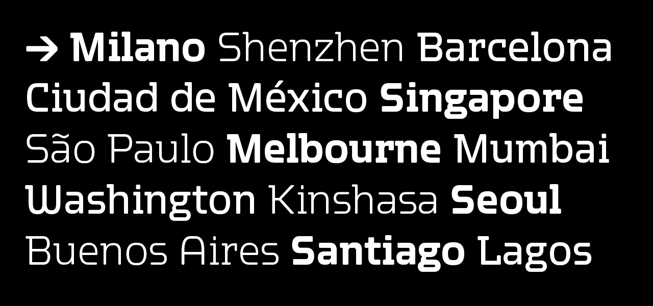
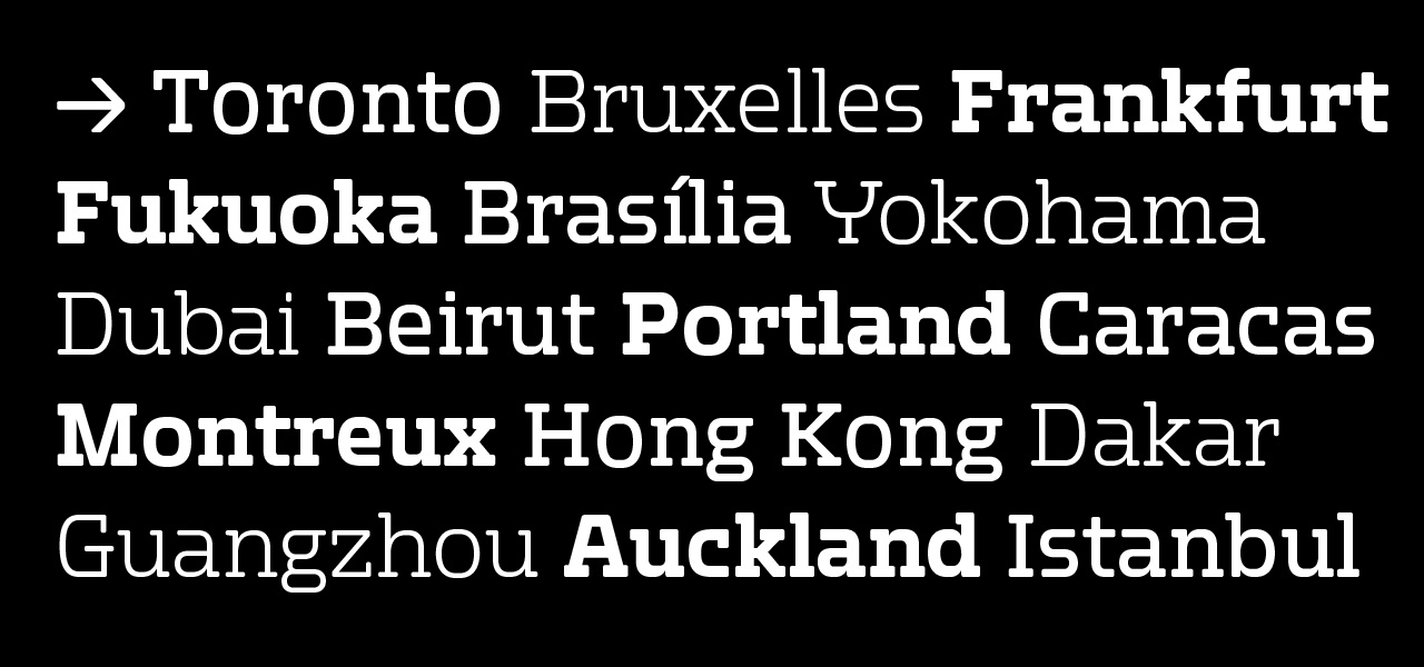
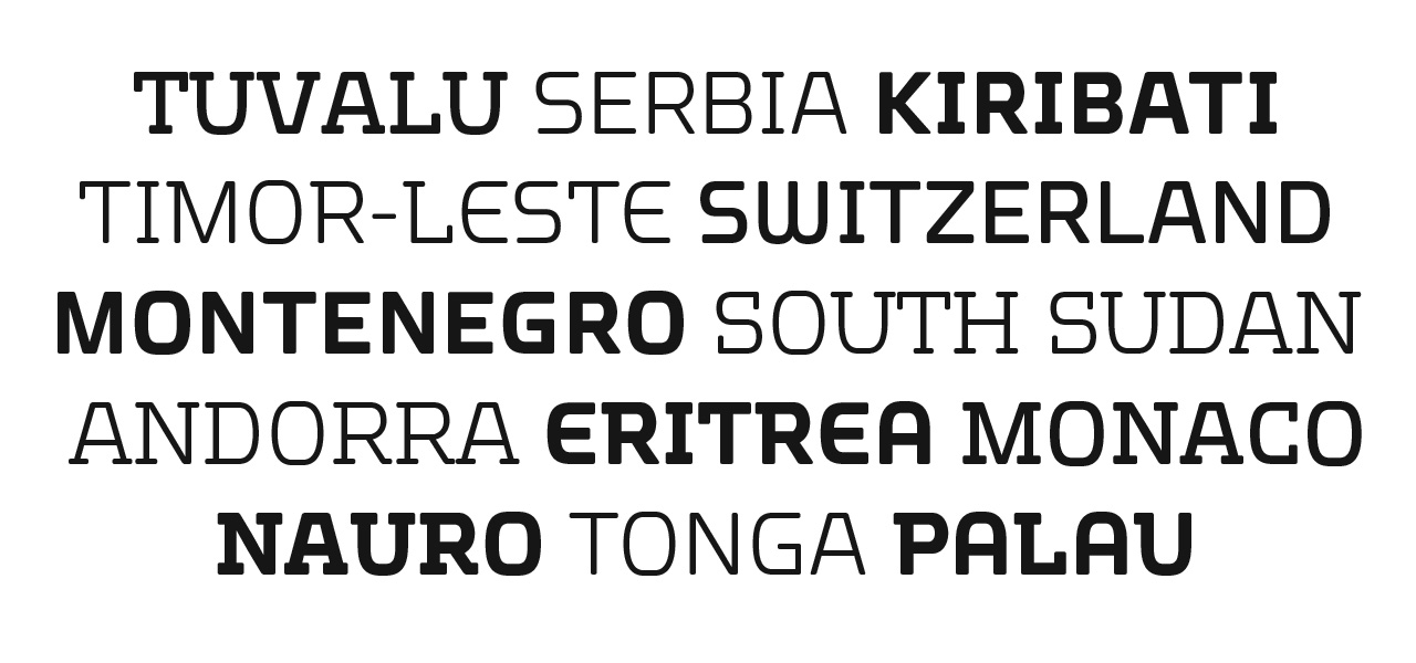
Final weights.
------------------------------
Client: 20th Century Fox/Dreamworks
Production Designer: Alex McDowell
Graphic Designer: Dianne Chadwick
Type Designer: Jens Gehlhaar
For more type design:
The Compendium of Alphabets
The International Music Feed (IMF) Network Identity
Custom Typeface for "Oblivion"