Custom typeface for “Oblivion”
DESIGNED 2011
In Joseph Kosinski’s Oblivion, an alien artifical intelligence called Tet captured a NASA capsule with two astronauts. They then created human clones as well as vehicles, habitats and interfaces by extrapolating data from the capsule.
If an alien civilization had to reverse-engineer not only human bodies and technology but also our communication means, they would have to make sense of the little markings that we call typography and figure out all sorts of things: the markings are grouped, sometimes the sizes and the alignments change, sometimes the little glyphs look the same as the larger glyphs (CcOoSs etc), and sometimes not (AaBbDd etc). To make things worse, the relationship between spoken English and its visual representation in Latin type is a hopeless mess.
NASA typically uses Futura or Helvetica for their instrument labels. It would have been interesting to use these generic shapes and generate an alien interpretation that is filled with misunderstandings. For instance, because the lettering in the NASA capsule was such a small sample and much of it would have been worn, some distinct glyphs might have looked the same to an alien race: The numeral zero and the letter O; or the uppercase P and R and B. Maybe an uppercase W would have been replaced by two separate Vs. Maybe the lettering on the instrument panels was poorly executed and the irregular word spaces would have been interpreted as a meaningful pattern.
This line of deconstructivist thinking was a hot commodity in art schools in the 1980s and 1990s. In fact, at California Institute of the Arts in the Mid-Nineties, we had a project called “Future Type” where students were encouraged to dream up scenarios like these. The visual textures that resulted were highly experimental and innovative, but nothing ever looked like Hollywood’s self-referential futurism, a visual language that seems to be locked in a lazy feedback loop. In that world, interfaces use square fonts and all industrial design is white.
One reason is that in Hollywood, story always trumps formal innovation. The graphic design in films has to live in the same space as the set design, and it cannot intrude into the story. This is specially true in a story structure like the one in Oblivion, where the audience is supposed to believe that the tower and the bubble ship are human-built. It is crucial for a detail like typography to not interfere with the deceit.
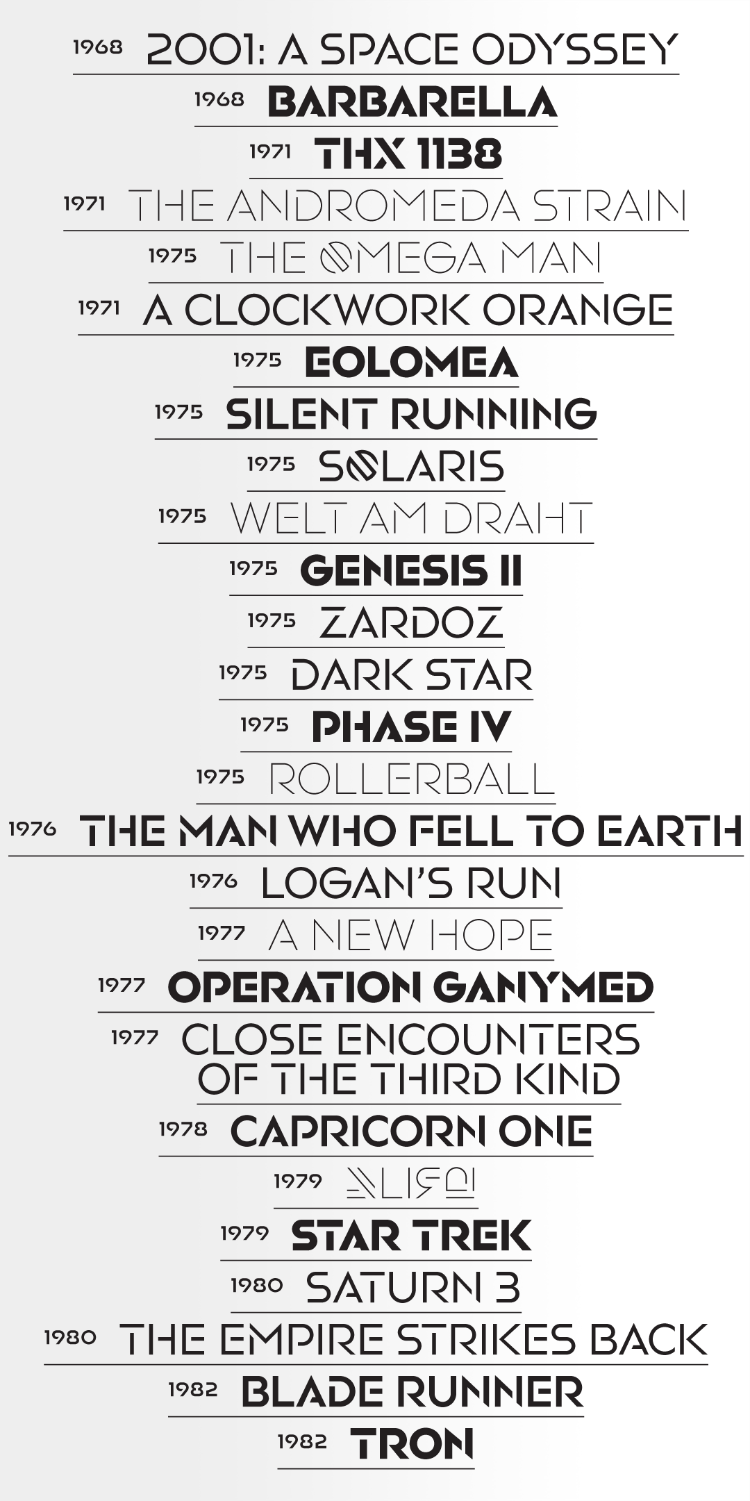
The final typeface design toys with a broken texture but still embraces some of Hollywood’s retro-futurism, especially considering its geometric modularity. In doing so, it owes more to Aldo Novarese’s Stop (1971) than to his Microgramma/Eurostile (1958; the font of choice for science fiction movies ever since 2001: A Space Odyssey). There’s also a hint of Glaser Stencil (1970) and the NASA worm logo (1975).
One of the initial ideas — the difficulty of tracking English phonetics with Latin letters — was pursued by including a few invented glyphs representing digraphs.
The typeface is used for the livery of the bubble ships and for various labels within the tower structures. The film’s graphic designer, Dianne Chadwick, designed the basic shapes and sketched out the weights, and I assisted with final drawings and engineering.
The fonts were also used for the graphic design of the light table within the film (designed by Gmunk), as well as the titles and trailers (designed by Danny Yount at Prologue). When creating the movie posters, Universal Picture’s marketing team decided to make their own version by cutting stencil gaps into Christian Schwartz’s Neutraface.
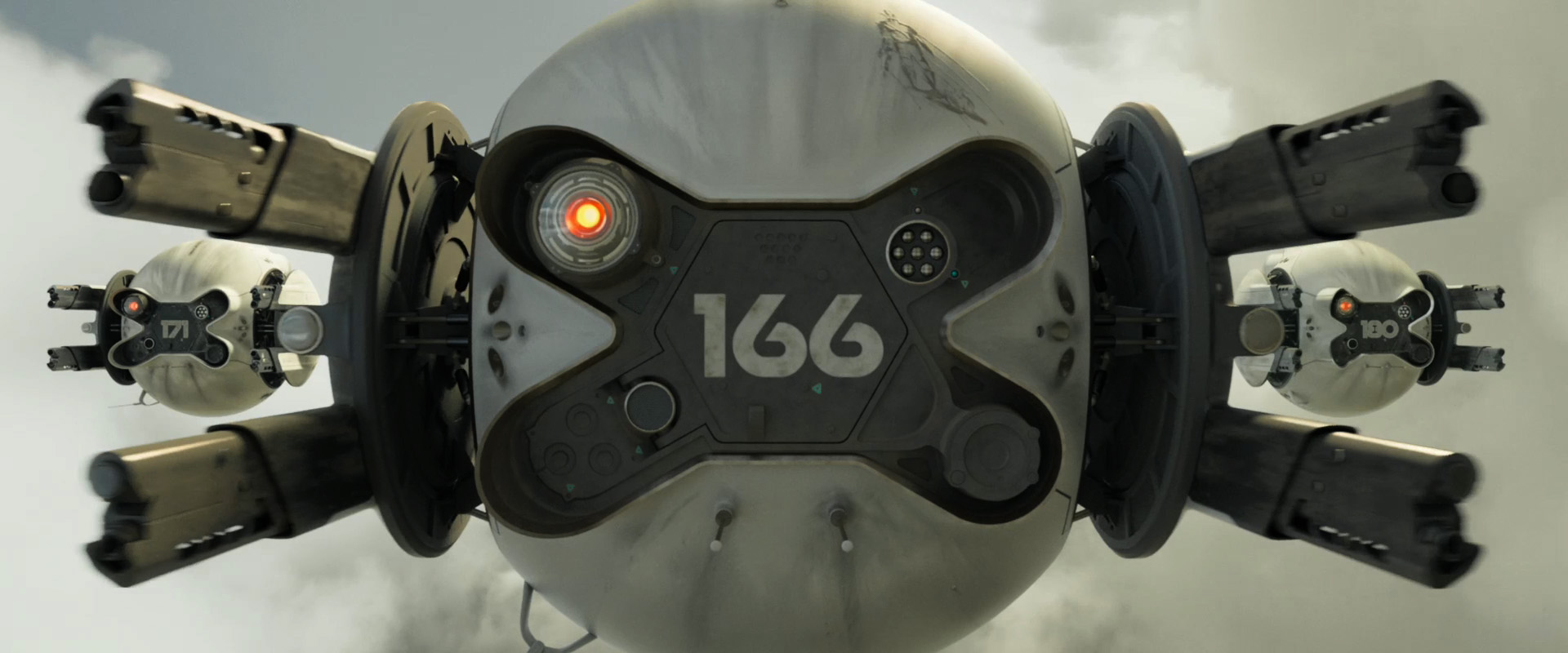
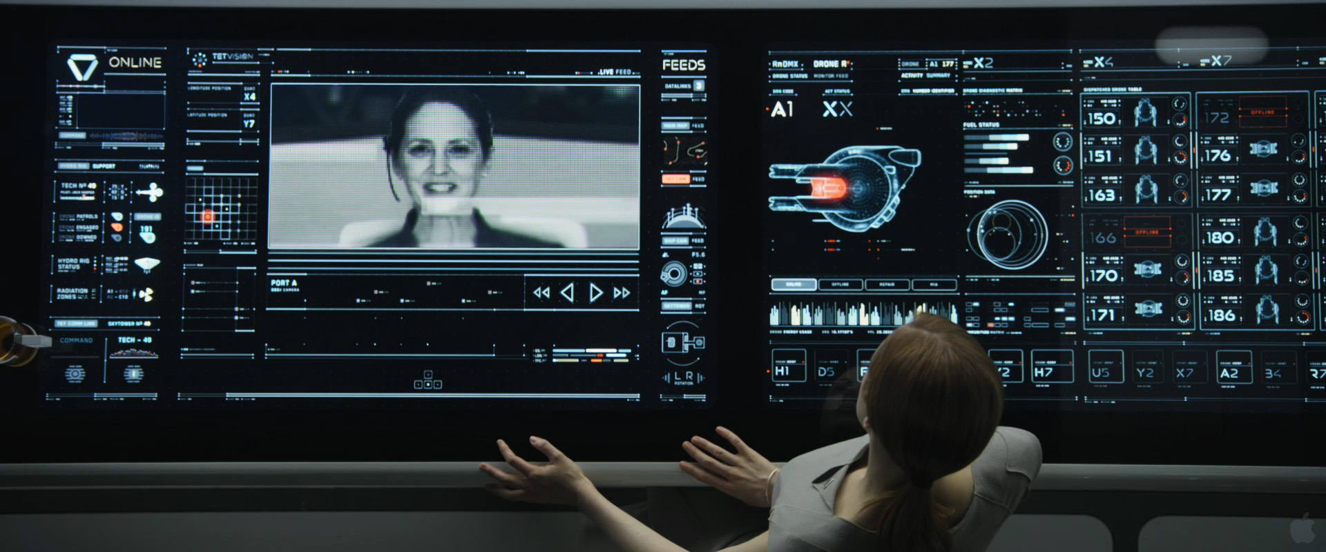

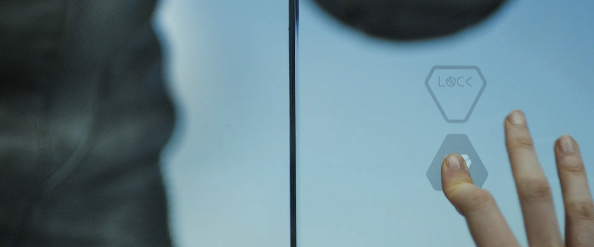
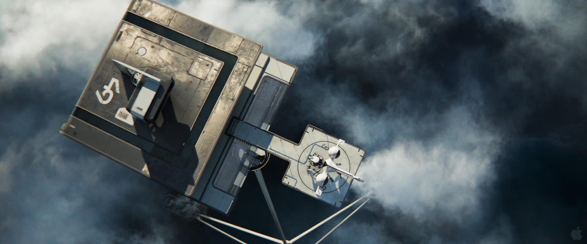
How it looks like in the movie.
-----------------------------------
Client: Universal Pictures
Production Designer: Darren Gilford
Graphic and Type Designer: Dianne Chadwick
Type Designer: Jens Gehlhaar
For more type design:
Custom Typeface for "Minority Report"
The Compendium of Alphabets
The International Music Feed (IMF) Network Identity
Client: Universal Pictures
Production Designer: Darren Gilford
Graphic and Type Designer: Dianne Chadwick
Type Designer: Jens Gehlhaar
For more type design:
Custom Typeface for "Minority Report"
The Compendium of Alphabets
The International Music Feed (IMF) Network Identity