FF Neuwelt
DESIGNED 2005—2019
BUY IT AT FONTSHOP OR MYFONTS
FF Neuwelt is an optimistic transatlantic sans serif that combines elements from the 1910s to the 1970s:
Its skeletons trace German elementary type by Renner, Erbar and Koch. Its stroke endings are derived from English proto-humanist models by Johnston, Curwen and Gill. Its horizontal rhythm echoes continental realist grotesques by Frutiger, Excoffon and Novarese. Finally, its generous x-height and tight tracking are fashioned after American phototype-era releases by Caruso, Lubalin and Benguiat.
FF Neuwelt is spaced for display and medium sizes; FF Neuwelt Text is customized for text sizes. The family comes with a wide range of alternate characters and four sets of numerals.
FF Neuwelt received a Certificate of Excellence by the Type Directors Club in 2020.
1
The Skeletons
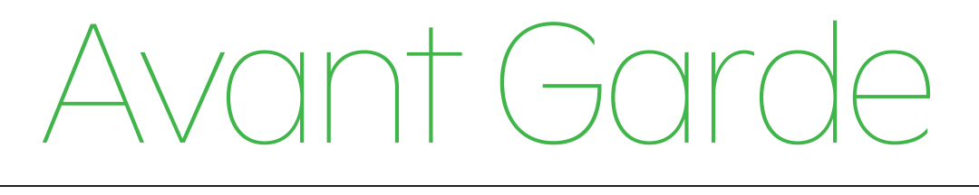
Usually, in a type release blurb such as this, FF Neuwelt should be classified as a geometric sans. The label fits comfortably when it describes Futura, Avant Garde Gothic or Avenir, but less so with others: There is not a clean lineage, just a hodgepodge of fonts informed by architecture theory, Art Deco fashion, market forces, naiveté and technical limitations such as printing speed or computer memory.
Sometimes a single-storey a seems to be all that is required for a sans serif to be regarded as geometric. Sometimes, square-ish grotesques such as Eurostile are included in the category although their bowl construction is measurably more complex than, say, Optima. The British Standard Vox classification calls for simple geometric shapes and a monoline construction. These are rather blurry, gradual qualifiers that could be used to describe typefaces as conceptually diverse as ITC Bauhaus, Bank Gothic, Busorama and Brown.
In Germany between 1914 and 1928, type designers Paul Renner, Jakob Erbar and Rudolf Koch strove to capture the Bauhaus and De Stijl compass-and-circle zeitgeist, but their subtly modulated shapes had little to do with proper circles. Meanwhile, in England between 1912 and 1926, Harold Curwen, Edward Johnston and Eric Gill did use compasses but applied them to rather Renaissance proportions and rhythms. In respect to Gill Sans, Robert Bringhurst called this a language “composed of latently humanist and overtly geometric forms”. 1 Describing Avenir and Gotham, Stephen Coles calls them not merely geometric and “more natural than mechanical”. 2 Speaking about Concorde (a precursor to Frutiger), Adrian Frutiger describes the circular and symmetrical bowls as “static” and the flat curve endings of a c e and s as “dynamic”. 3
I’d argue that most typefaces are geometric; some just feature more complex geometry. While this may sound like hyperbole, the statement is quite literally true in regards to digital font formats which use Bézier curves to describe outlines, regardless of whether the font is Futura or Garamond. In any case, the round characters in Neuwelt are no more and no less circles than those in Helvetica.


Gill Sans (1928; here set in Gill Sans Regular).
Neue Haas Grotesk (1957; here set in Neue Helvetica 55).
FF Neuwelt (2005—19).
Neue Haas Grotesk (1957; here set in Neue Helvetica 55).
FF Neuwelt (2005—19).
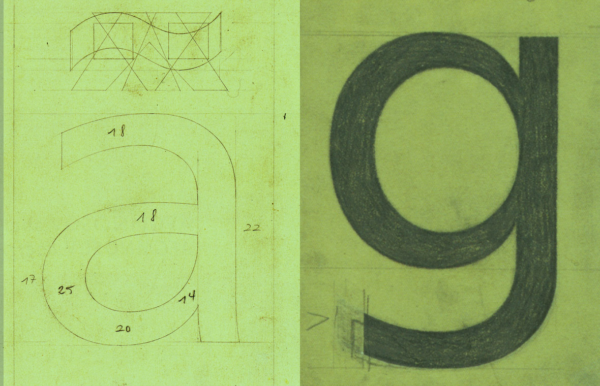
Maybe a better term for these kinds of typefaces would be ‘elementary’. In Futura, all glyphs are based on the simplest acceptable skeleton, often using uppercase shapes to inform the lowercase’s design and willfully eradicating all traces of writing. It features one-storey lowercase a and g, it leaves out the curled feet in j t y, and the spurs on lowercase u and uppercase G. In 1920s Germany, in a typographic world filled with Cheltenham, Jugendstil oddities, Akzidenz Grotesk and of course blackletter, these shapes must have felt radical and futuristic.


Schelter & Giesecke-Grotesk (1890, here set in FF Bau Medium).
Futura Buch (1927, here set in URW Futura T Book).
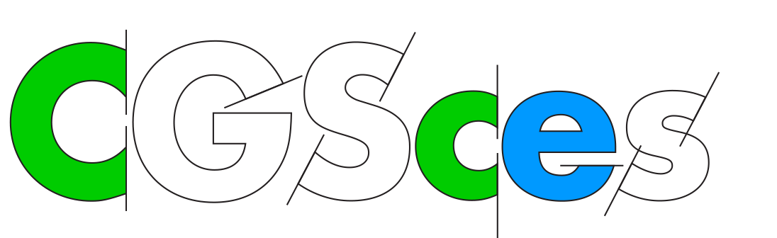
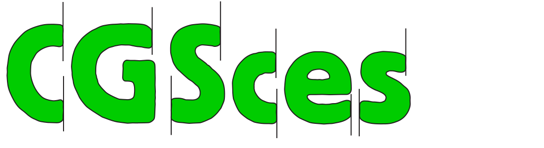
The display version of Neuwelt copies all of Renner’s elemental glyph skeletons. Less reductionist characters with tails and spurs are available as alternate characters and, when applied, seem to not only modulate the look-and-feel, but to shift its entire classification towards the humanist sans category.
Futura Buch (1927, here set in URW Futura T Book).
The display version of Neuwelt copies all of Renner’s elemental glyph skeletons. Less reductionist characters with tails and spurs are available as alternate characters and, when applied, seem to not only modulate the look-and-feel, but to shift its entire classification towards the humanist sans category.


Neuwelt with and without alternate characters.
This is not a new trick. In the 1930s, Monotype reacted to the runaway success of Futura by releasing alternate characters for Gill Sans, primarily targeting the German and US markets. In this instance, marketing forces turned Gill Sans from a sort-of-humanist sans to a sort-of-geometric one. For the same reasons, similar sets of alternate characters were produced for Kabel, Erbar and Metro.
Including a round a, a simple g or a spurless u also turns typefaces into schoolbook fonts as those are the elementary shapes kids learn first. For instance, my high school history text book was typeset in Monotype’s German Gill Sans. Bizarrely, although published in 1974, it featured blackletter-style letterspacing as a mark-up level (in lieu of italic, bold, color or underline). 4
2
The Terminal Design
a. Diagonal Terminals
In early sans serifs, a stroke was more or less cut off at an angle orthogonal to its final direction, regardless of whether that stroke was straight or curved. This is apparent in grotesques such as the first recorded sans serif — English Egyptian by Caslon, 1816 —, as well as practically all other 19th century Gothics or Grotesques.
For these sans-serif pioneers, this was the most logical solution: These letters were thought of as monolinear, as having no discernible stroke modulation or terminal emphasis; and as being constructed “block” letters rather than having any cursive or calligraphic traces.
During the first century of sans-serifs, curved strokes were cut off either orthogonally to their final direction — or following dubious calligraphic roots, resulting in highly inconsistent angles.
Franklin Gothic (1908; here set in Bitstream Fraklin Gothic)
Kabel (1928; here set in Linotype Kabel Heavy)
Metro (1930; here set in Linotpye Metro Black Two)
Friedrich-Bauer-Grotesk (1935; here set in FF Bauer Grotesk Bold)
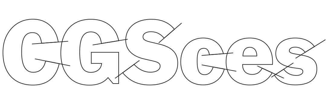
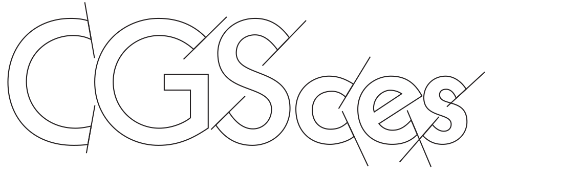
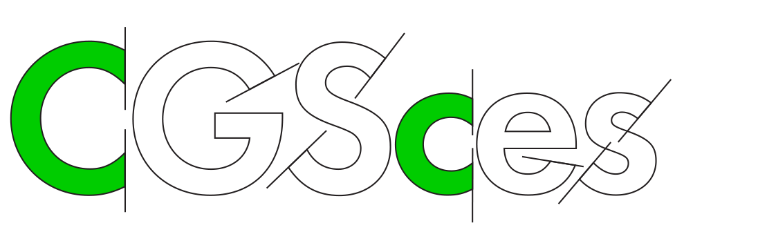
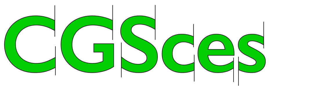
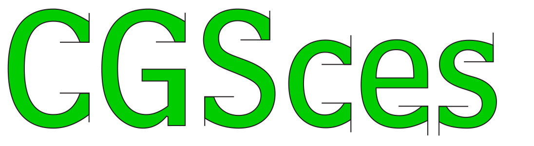
The production of sans-serifs intensified in the 1910s and 1920s in England, Germany and the United States; and the approaches to stroke endings grew positively bewildering. The variations shown in Dwiggins’ Metro and Koch’s Kabel may be explained by their creators’ backgrounds in calligraphy. But what about Futura’s treatment of G C S c e s? Over three years of production, Paul Renner and the Bauer type foundry explored a curious amount of alternate lower case designs, yet among all of them, not a single c had slanted terminals to match the s and the e.
The reason is mundane: In German spelling, C c almost exclusively occurs before H h or K k (hence the ch and ck ligatures shipped with the first Futura release). This explains the unique C c designs: Compared with G, they look oddly chopped, but in advance of H h K k, they produce a preferable letter fit. 5

Paul Renner’s Futura displays a somewhat inconsistent approach to terminals. The same designer’s Plak introduces completely horizontal ones, predicting the next generation of sans serifs, the neo-grotesques.
Futura Halbfett (1927; here set in URW Futura T Demi)
Futura Fett (1927; here set in URW Futura T Bold)
Neuzeit-Grotesk (1928; here set in DIN 30640 Neuzeit Grotesk Light)
Fette Plak (1928; here set in Linotype Plak Black)
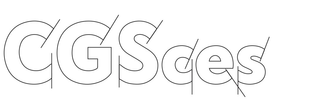
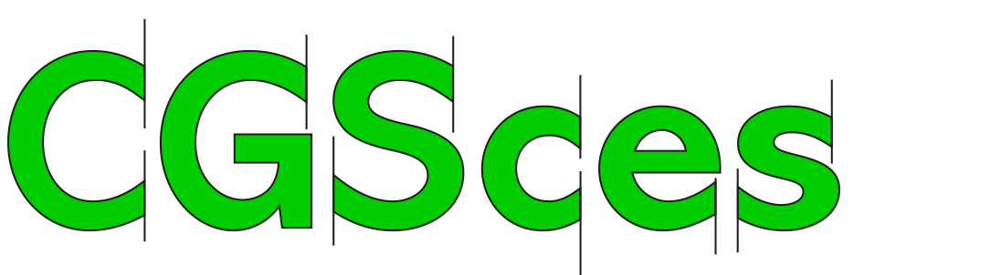
b. Horizontal Terminals
However, this still doesn’t explain why Futura Fett’s e has a horizontal terminal, especially when compared to the angular endings in lighter weights. Interestingly, just a year after Futura, Paul Renner published a typeface with consistently horizontal terminals: Plak, released by the Stempel foundry in 1928 and marketed as a bold companion for Neuzeit-Grotesk.
Because Plak was designed in three widths (not weights), Renner evidently arrived at the same conclusion that Adrian Frutiger reached twenty-five years later: When Frutiger mapped out Univers, he realized that the only shapes that can be widened and fattened without displaying undesirable distortion are static, symmetric ones with horizontal stroke endings “like uncials” 6 (The same observation also led Frutiger to believe that italic and cursive forms should not be made for sans serifs).
There had been a few nameless Groteskschriften and American Gothics with horizontal stroke endings on round characters before Plak, certainly in condensed weights and in fonts with tight apertures. But only in the hands of Renner did this start to look modern. The regular-width cut of Plak has remained a lasting inspiration until today, serving as a source for both Graphik (Christian Schwartz, 2009) and San Francisco (Apple, 2014).
The horizontal ending received renewed and surprisingly synchronized interest in the 1950s with the release of five typefaces from continental Europe. In 1952, Microgramma from Italy; and then Neue Haas Grotesk from Switzerland, Univers from France, Mercator from the Netherlands, and Folio from Germany — all of them, improbably, released in 1957.
Futura Halbfett (1927; here set in URW Futura T Demi)
Futura Fett (1927; here set in URW Futura T Bold)
Neuzeit-Grotesk (1928; here set in DIN 30640 Neuzeit Grotesk Light)
Fette Plak (1928; here set in Linotype Plak Black)
b. Horizontal Terminals
However, this still doesn’t explain why Futura Fett’s e has a horizontal terminal, especially when compared to the angular endings in lighter weights. Interestingly, just a year after Futura, Paul Renner published a typeface with consistently horizontal terminals: Plak, released by the Stempel foundry in 1928 and marketed as a bold companion for Neuzeit-Grotesk.
Because Plak was designed in three widths (not weights), Renner evidently arrived at the same conclusion that Adrian Frutiger reached twenty-five years later: When Frutiger mapped out Univers, he realized that the only shapes that can be widened and fattened without displaying undesirable distortion are static, symmetric ones with horizontal stroke endings “like uncials” 6 (The same observation also led Frutiger to believe that italic and cursive forms should not be made for sans serifs).
There had been a few nameless Groteskschriften and American Gothics with horizontal stroke endings on round characters before Plak, certainly in condensed weights and in fonts with tight apertures. But only in the hands of Renner did this start to look modern. The regular-width cut of Plak has remained a lasting inspiration until today, serving as a source for both Graphik (Christian Schwartz, 2009) and San Francisco (Apple, 2014).
The horizontal ending received renewed and surprisingly synchronized interest in the 1950s with the release of five typefaces from continental Europe. In 1952, Microgramma from Italy; and then Neue Haas Grotesk from Switzerland, Univers from France, Mercator from the Netherlands, and Folio from Germany — all of them, improbably, released in 1957.


In the mid-1950s a flurry of releases firmly established horizontal terminals as the new standard.
[UC: Microgramma, 1952] Eurostile Nero (1962; here set in URW Eurostile T Bold)
Folio (1957; here set in Adobe Folio Medium)
Neue Haas Grotesk (1957; here set in Neue Helvetica Bold)
Univers (1957; here set in Univers BQ 65 Bold)
The closed apertures of these 1950s designs were never intended to increase legibility or readability but were thought to look “more balanced and matter-of-fact” as opposed to diagonally cut ends that looked “as though they have not been properly executed yet”, as Frutiger pointed out 7. The methodic consistency and systematic modularity of the new typefaces paralleled the pragmatic, science-driven progressivism of the Homo Faber era.
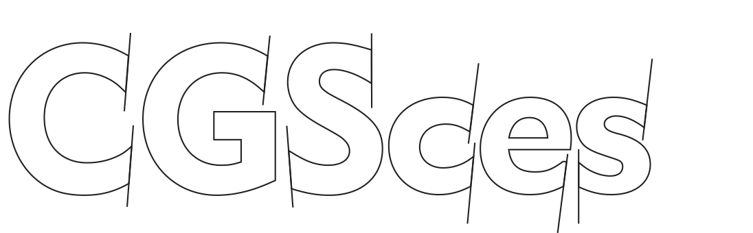
c. Vertical Terminals
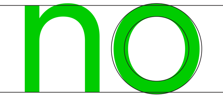
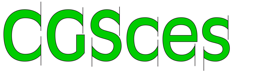
Neuwelt’s consistently vertical stroke endings on round characters are most obviously following the British proto-humanist models first devised in London Underground (1916), Monotype Gill Sans (1928) and Curwen Sans (1912/1928).
Older than these British types and less known is Block, first published by Berthold in 1908 and attributed to Hermann Hoffmann. Only available with roughened outlines and in bold weights, it was never a candidate for timelessness, but its big x-height and tight fit made it quite popular in 1970s Germany and England. Note the absurdly narrow C c, typical for types by German foundries of the time.
[UC: Microgramma, 1952] Eurostile Nero (1962; here set in URW Eurostile T Bold)
Folio (1957; here set in Adobe Folio Medium)
Neue Haas Grotesk (1957; here set in Neue Helvetica Bold)
Univers (1957; here set in Univers BQ 65 Bold)
The closed apertures of these 1950s designs were never intended to increase legibility or readability but were thought to look “more balanced and matter-of-fact” as opposed to diagonally cut ends that looked “as though they have not been properly executed yet”, as Frutiger pointed out 7. The methodic consistency and systematic modularity of the new typefaces paralleled the pragmatic, science-driven progressivism of the Homo Faber era.
c. Vertical Terminals
Neuwelt’s consistently vertical stroke endings on round characters are most obviously following the British proto-humanist models first devised in London Underground (1916), Monotype Gill Sans (1928) and Curwen Sans (1912/1928).
Older than these British types and less known is Block, first published by Berthold in 1908 and attributed to Hermann Hoffmann. Only available with roughened outlines and in bold weights, it was never a candidate for timelessness, but its big x-height and tight fit made it quite popular in 1970s Germany and England. Note the absurdly narrow C c, typical for types by German foundries of the time.
Block (1908; here set in Berthold Block Regular)
Gill Sans (1928; here set in Gill Sans Medium)
Antique Olive (1962; here set in Antique Olive Roman)
Abadi (1987; here set in Monotype Abadi Bold)
However, for more than three decades through the middle of the 20th century, Gill Sans was the best-known sans serif that offered vertical endings on round strokes with consistency — at least in the primary letter set. (Its predecessor, Johnston’s London Underground, messes up its otherwise perfect record with the meathook uppercase S.)
Only around 1960 was this trait picked up again, this time in France. Roger Excoffon used it in his Antique Olive (1962, begun as the logotype for Air France in 1958); and Adrian Frutiger applied it to Concorde (1962).
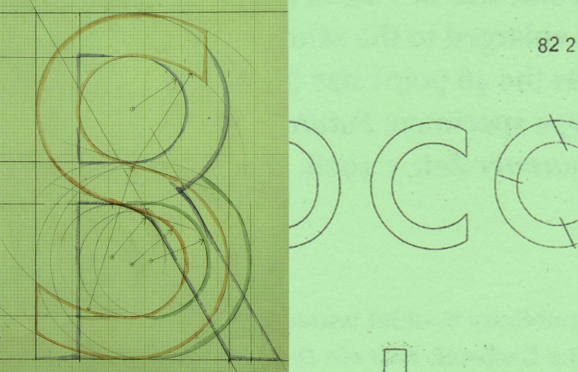
Drawings for Gill Sans, Futura Buch and Concorde.
Frutiger drew only one tapered terminal and let assistant André Gürtler execute the rest, resulting in a typeface that precedes the innovations of Frutiger’s eponymous sans by fourteen years. The construction of that terminal wasn’t really all that different from Gill Sans, but Concorde’s overall color was more modern: Frutiger took Gill’s humanist open aperture but combined it with the neo-grotesque rhythm of the time. Unavailable since 1964, it’s a bit of a prophetic link in the canon of sans serifs, much like Curwen Sans, Romulus Sans or GST Polo.
Concorde then served as a basis for Roissy, designed for the Paris airport’s signage in 1972. Two years later, Linotype Mergenthaler asked Adrian Frutiger to turn Roissy into a typeface for print. Renamed Frutiger to feign off copycats 8, it was published in 1976.
Today there is an abundance of sans serifs with vertical stroke endings, among them Abadi (1980), Verdana (1996), Guardian Sans (2009) and Metric (2011).
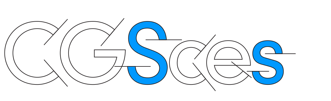
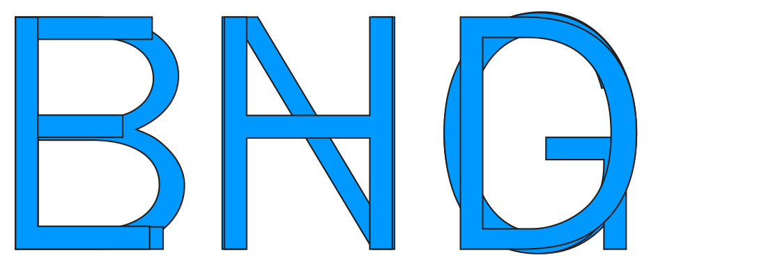
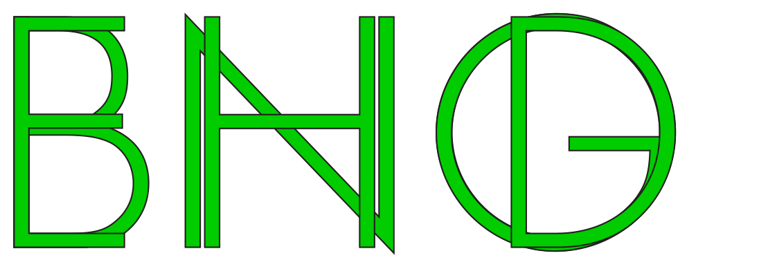
Left: Concorde (Adrian Frutiger, 1962).
Right: FF Neuwelt using Opentype alternates.
d. Beak Terminals
Frutiger’s release year of 1976 also saw the publication of Bell Centennial, designed by Matthew Carter for AT&T. An update of Bell Gothic (1930), its stroke endings are both vertical and horizontal, creating a beak-shaped (arrow-shaped?) finial. Designed for high speed printing on the pulpy paper of telephone books, the typeface is usually fancied for its violent ink traps. This and every other design detail in Bell Centennial is fine-tuned for unambigious character identification at small sizes. The beak terminal adds heft to the stroke ending to increase legibility, serving the same purpose as ball terminals and vertical serifs in a seriffed font. Apart from postmodern serifs such as Palatino (1949), other designs using beak terminals are sans serifs like Martin Majoor’s Telefont (1994) and Stag Sans (2007).

Bell Centennial (1976; here set in Bell Centennial Sub Caption)
Stag Sans (2007; here set in Stag Sans Black)
Stag Sans (2007; here set in Stag Sans Black)
3
Realist Rhythm
Both Edward Johnston and Paul Renner based their majuscules on classical Roman capital proportions. Their construction falls nicely in line with the proportions of “circle, triangle and square”: Round characters such as C G O Q are as wide as circles, and B E F L P are half-square in width. This was seen as a major improvement over the uppercase rhythm of existing sans serifs, which Edward Johnston dismissed as “that nineteenth century style in which it was customary to make every letter occupy the same space and look as much like its neighbour as possible.” 9
Conversely, in the 1950s, Adrian Frutiger rejected the Roman capital proportions of Futura as “no longer contemporary”, arguing that as architecture is changing, type design should too 10. When designing Univers, he cited Greek lapidary scripts as a justification for the rhythm of the uppercase characters and described Irish-Roman uncials as the inspiration for the horizontal terminals. While that sounds somewhat fanciful, Frutiger’s successes show that these references are as legitimate as the more common practice of looking back to Roman inscriptions or Renaissance French seriffed type.
News Gothic (blue) follows the model of 19th century types in which beauty is achieved through consistency. Robert Bringhurst calls this a realist rhythm, Frutiger calls it Greek. Futura’s majuscules (green) are based on Roman Capitalis proportions in which beauty is achieved through contrast: Narrow characters are half a square wide, round characters are based on a circle.
Frutiger himself admitted that for the regular weight, the Roman principle may have been desirable. However, he was reaching for a large system with multiple weights and widths; and determined that it would have been impossible to implement for all twenty-one fonts. Yet even in later releases such as the ‘humanist’ Frutiger and the ‘geometric’ Avenir, planned initially without condensed or extended forms, he never went back to the Roman capital proportions, indicating that following the Greek rhythm was a personal preference as much as a logical conclusion.
The approach that Frutiger took with Univers is echoed in the rest of the class of ’57: Helvetica, Mercator and Folio. However, the stated intention for the release of Helvetica wasn’t to theorize about the weaknesses of Futura but to capitalize on graphic designers’ new-found enthusiasm for early grotesques such as Berthold Akzidenz Grotesk/Standard, Monotype Grotesque Nº215 and Venus. Helvetica was meant to be a modernized, rationalized version of those proto-grotesques.
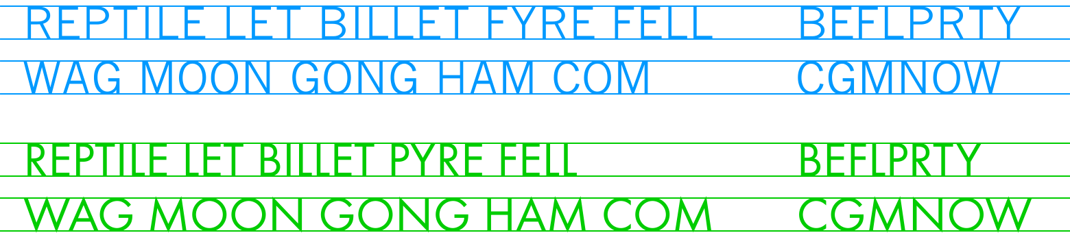
A comparison of Roman and Greek rhythms. While News Gothic (blue) runs fairly even in both lines (blue), the first line set in Futura (green) looks practically condensed when compared to the second line — an effect generated exclusively by choosing letters (i.e., writing).
In 1957, driven by the fast success of Neue Haas Grotesk and Univers, French type designer Roger Excoffon and Fonderie Olive in Marseilles set out to make their own version. Charmingly, what could have been another clone turned out to be Antique Olive, first released as Nord (1958) and then gradually extended to a family of eleven related typefaces (1962—1966). Antique Olive’s horizontal rhythm and modular quality echo the neo-grotesques, but that’s where the similarities end. Its main stylistic improvement over Univers were the open apertures generated by the vertical terminals. Its other innovation was of course the top-heavy proportioning and tall x-height, a daring and extravagant formal language informed by the legibility studies of ophthalmologist Émile Javal.
4
Tall X-Height
The initial impulse to design Neuwelt Black came in 2005 when my team at Californian design company Brand New School worked on an identity for a U.S. music channel. We liked the musical curves of Gill Sans and Antique Olive but couldn’t reconcile their vintage resonance with the currency of pop music. We liked the basic proportions of Futura Maxi but founds its rhythm a bit too syncopated, its engineering too dated and its glyph set too limited.

Gill Sans Bold, Futura Maxi Bold, Antique Olive Black, Neuwelt Extrabold.
Drawn by Victor Caruso in 1960, Futura Maxi is a simple exercise in raising Futura’s x-height. Paul Renner’s original requires generous white space to shine; its ascenders stretch too long when space is at a premium. However, instead of generating a version with the vertical proportions of Helvetica and Univers (which would have been the obvious models to follow in 1960), Caruso may have taken it too far for a text font. On the upside, Caruso’s Futura Maxi has more in common with the original than Renner’s own Steile Futura or Futura Black, two of type history’s most charming attempts at cashing in on a name.
Drawn by Victor Caruso in 1960, Futura Maxi is a simple exercise in raising Futura’s x-height. Paul Renner’s original requires generous white space to shine; its ascenders stretch too long when space is at a premium. However, instead of generating a version with the vertical proportions of Helvetica and Univers (which would have been the obvious models to follow in 1960), Caruso may have taken it too far for a text font. On the upside, Caruso’s Futura Maxi has more in common with the original than Renner’s own Steile Futura or Futura Black, two of type history’s most charming attempts at cashing in on a name.

Akzidenz Grotesk’s timelessness may be attributed to its fairly average proportion relative to widely used sans serifs of the 20th century.

Futura Maxi was designed for compact headlines rather than agate sizes; its x-height is a product of taste rather than of a quest for legibility.

Futura features a dramatic vertical proportion that is more akin of Renaissance romans than 19th century models.

Antique Olive seduces with expressive curves made for headlines, but its large x-height and top-heavy proportion render it incredibly legible at small sizes.

Spartan Classified is a version of Futura designed for sizes smaller than 6pt, hence the increased x-height and the compressed descenders.

In large sizes, FF Neuwelt’s tall x height produces compactness. In small sizes, it increases legibility.
Caruso’s Futura Maxi was published before the type foundry ITC was established but precedes their passionate habit of raising x-heights and tightening letterfit. Nonetheless, Futura Maxi seems to embody ITC’s canonized cliche of curious (or clownish, depending on your taste) revivals as much as ITC Garamond. Today, Caruso is best remembered for ITC Franklin Gothic, a timeless, sensible and useful extension of Morris Fuller Benton’s heavy sans serifs.
A decade before Futura Maxi, Mergenthaler Linotype had released a version of Futura called Spartan Classified, designed for printing at 5.5 pt type size. Here, the x-height was increased in order to improve legibility, not just usability. As is customary and necessary when drawing smaller optical sizes, widths were also increased. Curiously, in the process, the elegant Roman proportions of the original Futura majuscules were completely replaced by an odd and erratic rhythm: Spartan Classified may be the only typeface where the E is wider than the O.
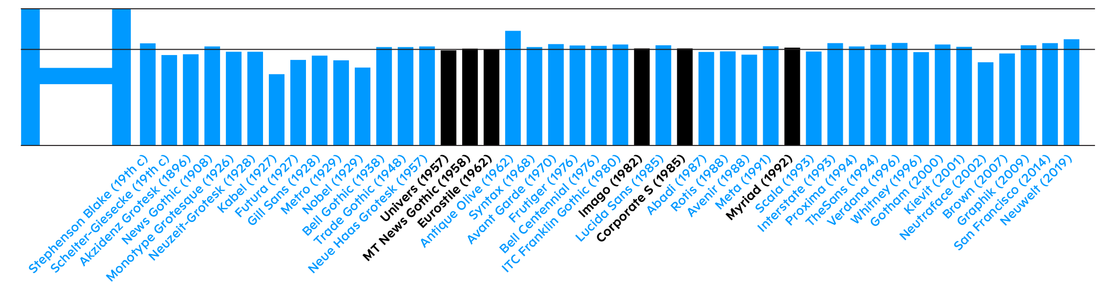
Below: A selection of sans serif typefaces and their x heights, measured relative to their cap height using their regular weights. Those closest to the average are marked black.
A decade before Futura Maxi, Mergenthaler Linotype had released a version of Futura called Spartan Classified, designed for printing at 5.5 pt type size. Here, the x-height was increased in order to improve legibility, not just usability. As is customary and necessary when drawing smaller optical sizes, widths were also increased. Curiously, in the process, the elegant Roman proportions of the original Futura majuscules were completely replaced by an odd and erratic rhythm: Spartan Classified may be the only typeface where the E is wider than the O.
Below: A selection of sans serif typefaces and their x heights, measured relative to their cap height using their regular weights. Those closest to the average are marked black.
5
Italics
For every designer of sans serif typefaces aiming at the quality of “nudity”, Adrian Frutiger’s designs are unsurpassed. It’s interesting to note that unlike most European designers today, he disliked italic companions for sans serif typefaces and preferred obliques instead. His main argument against cursive forms was that they cannot be stretched towards heavy weights or extended widths without turning absurd. When Linotype included a true italic with Frutiger Next in 2001, Frutiger pretty much disowned it 11.
My approach to sans serif italics is modulated. By themselves, any approach from an upright narrow Renaissance-style italic to a 28° slanted oblique can be exciting. But judging them in context with the roman and assuming they are used as a mark-up level, they should neither be too different nor too similar. For instance, when glyphs are simply slanted, an oblique angle below 12° typically does not produce enough difference.
Akzidenz Grotesk Italic (1896) features no cursive or italic
skeletons. Instead, the upright glyphs were merely manually slanted.
Among 20th century grotesques, Monotype Grotesque Nº215 (1926) is pretty much the only one to feature an italic character.

Gill Sans (1928) was one of the first sans serifs to include a proper italic.

Lucida Sans (1985), one of the first original PostScript typefaces and a curiously Dutch-looking American humanist, set the stage for a generation of true italics. Whether geometric (Neutra), humanist (TheSans) or even grotesque (National), in the DTP era virtually every sans serif received a proper italic companion, whether deserved or not.
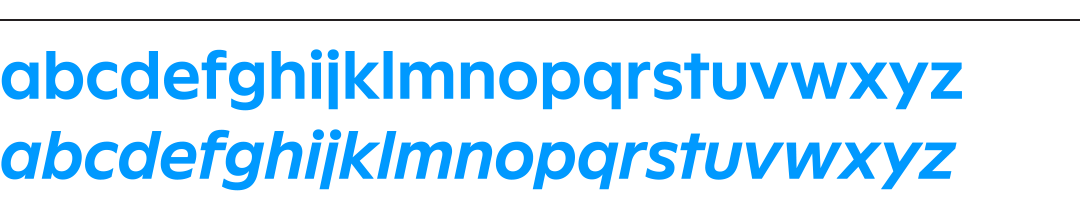
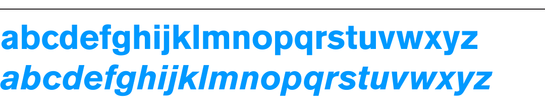
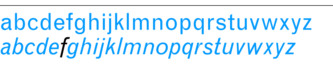
FF Neuwelt, in its default state, features only slanted, but no italic characters.
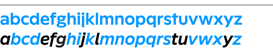
FF Neuwelt. For greater emphasis between roman and italic, the ratio of italic characters can be increased via Opentype alternates.
The approach presented in FF Neuwelt follows models such as Monotype Grotesque Nº215 or Akzidenz Grotesk. These obliques — manufactured in lead — were slanted by hand or pantograph, producing some surprising and inconsistent details. Apart from one obvious earmark character, the long f in Nº215, none of the skeletons qualify as italic or cursive, but there are subtle variations in stroke endings and widths, as well as some characters that seem to have been rotated more than slanted.
6
Among the four established sans serif categories — gothic, grotesque, geometric and humanist —, there is one signifier that may give away a typeface’s classification: The shape of the period. While not a perfect predictor, it is a pretty good one — at least for typefaces designed before the 21st century deluge of eclectic hybrids. 20th century gothics and grotesques mostly had square periods; geometrics and humanists mostly had round ones (There’s also Johnston’s pen-inspired rhombic dot, but that one never caught on elsewhere).
For a lot of reasons, the division makes sense. Humanist sans serifs are essentially modelled after Renaissance- or Baroque-era typefaces, and those possess — almost without exception — round periods. Most geometric sans serifs after Johnston used round periods, maybe as a means of contrast to square terminals or as a testament for their love of circles.
Gothic and grotesque typefaces were initially derived from slab serifs and cut in wide ranges of widths and weights. Square punctuation allowed for flexibility in condensed widths or light weights; and provided more ink impact for tightly fit muscular headlines. Also, gothics and grotesques are constructed from unmodulated strokes with squared terminals and, inspired by then brand-new industrial processes, celebrate modular repetition rather than humanist contrast. No surprise then that their periods were universally square, much like those of their slab serif antecessors.
6
Punctuation
Among the four established sans serif categories — gothic, grotesque, geometric and humanist —, there is one signifier that may give away a typeface’s classification: The shape of the period. While not a perfect predictor, it is a pretty good one — at least for typefaces designed before the 21st century deluge of eclectic hybrids. 20th century gothics and grotesques mostly had square periods; geometrics and humanists mostly had round ones (There’s also Johnston’s pen-inspired rhombic dot, but that one never caught on elsewhere).
For a lot of reasons, the division makes sense. Humanist sans serifs are essentially modelled after Renaissance- or Baroque-era typefaces, and those possess — almost without exception — round periods. Most geometric sans serifs after Johnston used round periods, maybe as a means of contrast to square terminals or as a testament for their love of circles.
Gothic and grotesque typefaces were initially derived from slab serifs and cut in wide ranges of widths and weights. Square punctuation allowed for flexibility in condensed widths or light weights; and provided more ink impact for tightly fit muscular headlines. Also, gothics and grotesques are constructed from unmodulated strokes with squared terminals and, inspired by then brand-new industrial processes, celebrate modular repetition rather than humanist contrast. No surprise then that their periods were universally square, much like those of their slab serif antecessors.


The shape of the dots can be an effective predictor for a typeface’s classification in the absence of other earmark characters.
Helvetica, Frutiger Next, FF Neuwelt with optional square dots
Avenir, Myriad, FF Neuwelt with default round dots
While the full stop may seem like a tiny detail, its shape informs many related glyphs; and their frequency in use has a massive impact on the appearance of the typeface. When the period is drawn like a rectangle, the i-dot, the comma, the exclamation mark, the apostrophe, quotation marks, the dieresis and a few others usually also have rectangular shapes. When the period is drawn like a circle, at least all other dots fall into line; the comma and related glyphs may then be single angled strokes with square or round endings; or round “9” and “6” shapes.
The few typefaces that don’t support this theory are mostly natural born rebels. For instance, the round dots of Antique Olive not only match the spirit of its curves but also push its classification from 1950s Neo-Grotesque towards the Humanist Sans category, whose sole inhabitant at the time was Gill Sans.
Frutiger (1976) and Myriad (1992) were deemed so similar that the latter’s publication led to a few angry letters between Linotype and Adobe. Adrian Frutiger described Myriad as Frutiger’s cousin with “a round dot over the i and a true cursive” 12. These two traits alone place Myriad firmly in the Humanist category, while Frutiger straddles the fence between Grotesque and Humanist or, as Mr. Frutiger described it, between static and dynamic shapes.
FF Neuwelt features round punctuation as the default; and square punctuation as an Opentype style.
1. Robert Bringhurst, The Elements of Typographic Style, Hartley & Marks, 1992/2005, p258. back
2. Stephen Coles, The Anatomy of Type, Harper Design, 2012, p159. back
3. Heidrun Ostere and Philipp Stamm (Ed.), Adrian Frutiger Typefaces.The Complete Works, Birkhäuser, 2009, p155. back
4. Grundzüge der Geschichte, Verlag Moritz Diesterweg, 1974. back
5. Christoper Burke, Paul Renner: The Art of Typography,
Princeton Architecturel Press, 1998, p105. back
6. Ostere and Stamm (Ed.), p92. back
7. Ostere and Stamm (Ed.), p96. back
8. Ostere and Stamm (Ed.), p254—255. back
9. Edward Johnston, Writing & Illuminating & Lettering, Dover Publications, 1995 (republication of 1906 original & 1936 revision), p89. back 10. Ostere and Stamm (Ed.), p88. back 11. Ostere and Stamm (Ed.), p260. back 12. Ostere and Stamm (Ed.), p258. back
---------------------------------------------------
Published by FontFont, Berlin, Germany Distributed by Monotype
Type Designer: Jens Gehlhaar
For more type design:
Custom Typeface for "Oblivion"
Custom Typeface for "Minority Report"
The Compendium of Alphabets
The International Music Feed (IMF) Network Identity
Award:
Certificate of Excellence, Type Directors Club, 2020
For more type design:
Custom Typeface for "Oblivion"
Custom Typeface for "Minority Report"
The Compendium of Alphabets
The International Music Feed (IMF) Network Identity
Award:
Certificate of Excellence, Type Directors Club, 2020